Latest Work

Archive

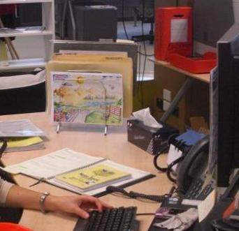
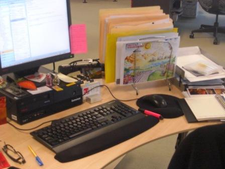
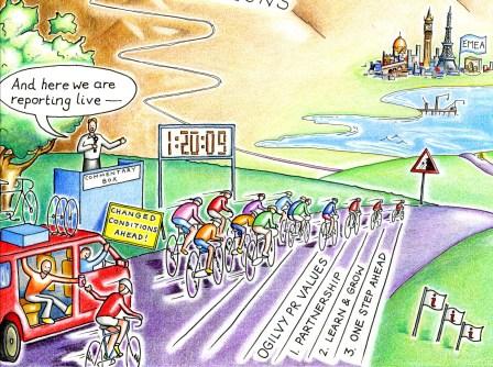
Visual agenda for a graphic recording session

Graphic recording: agenda for client session
Graphic recording: agenda for client session

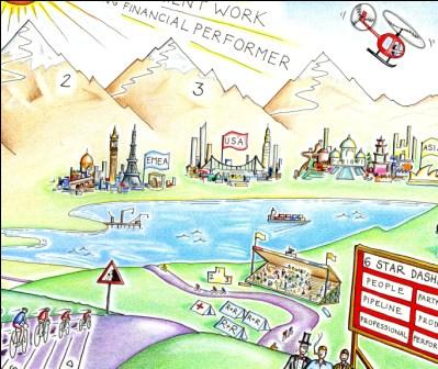
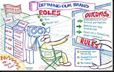
I developed this visual agenda as an example of a graphic recording tool that can be used during a strategy or facilitation session. The poster size is approximately 4m long x 2m wide. It’s main objective is to create an impactful, themed and eye-catching agenda that the facilitator and, more importantly, the participants can refer to during their session so they can stay focused, stay on track and ultimately ‘see the bigger picture’. This fresh approach injects life and energy into an agenda – an item that can easily become lifeless, dull or simply overlooked.

Airds OutLOUD!: graphic recording for community engagement

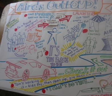
Airds OutLOUD!: Hip Hop workshop

Airds OutLOUD!: Hip Hop workshop

Airds OutLOUD! was a large scale Housing NSW community renewal event held in Airds, near Campbelltown in July 2009. Straight Talk, a leading specialist consultancy in community engagement (and great team to work with), hired me to graphic record several sessions.

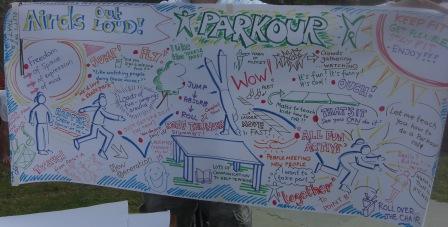
During the event, there were several ‘youth activity hubs’, offering a range of opportunities for kids and young people to get involved, such as Parcour (a physical activity where kids leap on walls and roofs) and Hip Hop.  As the young people took part they had conversations with the activity and leaders about what it is like to live in Airds.

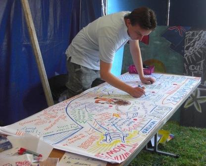
Using my graphic recording skills, my brief was to capture the ideas and feelings graphically and visually. It was fast and furious work as things moved quickly. I produced a colourful, engaging record of what young people were thinking. Later, my posters were used for more formal planning exercises where it can be hard to capture and hear the voice of young people.

Airds OutLOUD!: recording the Parcour session

Airds OutLOUD!: recording the Parcour session

Airds OutLOUD!: completed Parcour poster

Airds OutLOUD!: completed Parcour poster

Airds OutLOUD!: Hip Hop Graphic Recording detail

Airds OutLOUD!: Hip Hop Graphic Recording detail

BBCi Live Chat Studio launch: wall design

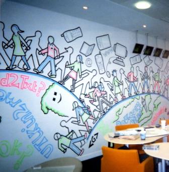
BBCi Live Chat: main wall design

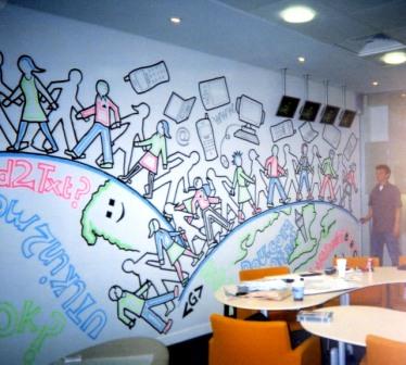
BBCi Live Chat Studio launch: main wall design

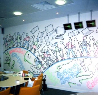
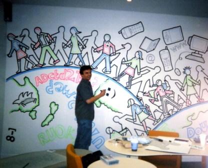
I worked on the launch of the BBCi Live Chat Studio (The Strand, London) in 2002 and was given the open brief to decorate the inside creative space (which was viewable by passers-by from the street) in a way that would attract attention and illustrate the way the BBC is using technology to inspire a two way connection with its audiences. The wall was approximately 10m long and 3 metres high — I completed the project to a tight deadline (I only had access to the room for 6 hours so really had to plan my design to the Nth degree before cracking open my paint pens and getting busy).

BBCi Live Chat Studio: wall design

BBCi Live Chat Studio: wall design

BBCi Live Chat Studio: my mess and old coffee cups in view

BBCi Live Chat Studio: my mess and old coffee cups in view

 My challenge was to grasp and communicate some pretty complex ideas across a large space (e.g. interactivity, global communications, varied audiences etc) and in a simple, eye-catching manner. It’s definitely one of the best jobs I have done (and without knowing probably the start of my foray into large scale graphic recording 7 years later). Standing back to look at it after 6 hours of intense work, I got one massive buzz. Sadly, it was wiped off a few days after launch — but that’s life.

BBCi Live Chat Studio: impending deadline but still smiling

BBCi Live Chat Studio: impending deadline but still smiling

B&W illustration: English village church

East Clandon Church, Surrey, England

East Clandon Church, Surrey, England

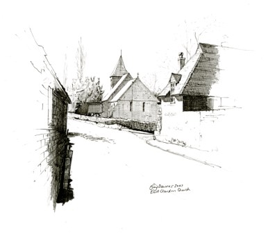
The beauty and history of English churches is fascinating. This black and white pencil illustration was a private commission for a collector – it is one of my favourites as the cut away pencil shading takes the viewer’s eye down the lane way towards the church. Black and white pencil illustrations to emphasise light and shade are so simple and the earliest technique I learnt — but it’s one I can’t shake and one I can’t get out of my system. Nor do I ever want to.

Children’s book illustration: The Secret Garden

Ssssh...the secret garden

Ssssh...the secret garden

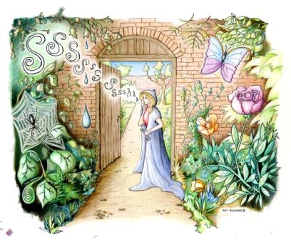
For decades now, I have been interested in the concept of a ‘secret garden’. I think it stems from growing up as a kid in the country and exploring the surrounding gardens, fields and countryside. This illustration depicts a hidden secret garden that you (the viewer) is being ushered into quietly by a mysterious caped lady. I pitched the style of this illustration for a children’s story book and included the detail that kids love: darkness, an evil spider and shadowy undergrowth on the left transitioning into warm, beautiful flowerbeds full with a friendly, fluttering butterfly on the right.

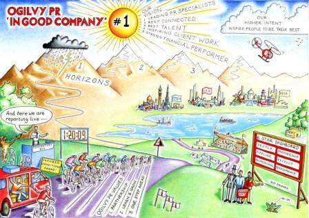
Ogilvy PR office move: ‘Welcome Guide’

Ogilvy is heading north

Ogilvy is heading north

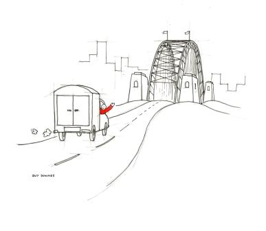
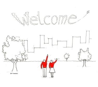
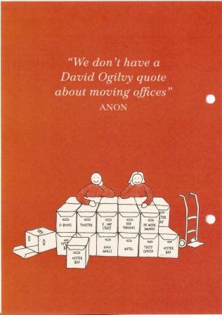
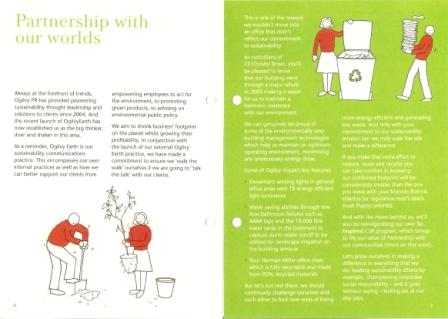
The Ogilvy PR family of specialist communication businesses moved ‘north’ with the majority of other Ogilvy and STW companies in July 2008. My illustrations played an important role in one key element of this move for Ogilvy PR – the internal communications. It was very important to make the move from Sussex Street in the hustle and bustle of the Sydney CBD to St Leonards as seamless as possible. Ogilvy PR put a lot of time, thought and man hours into getting this right. One ingredient was ‘Welcome Guide’  that every employee received on their first day in the new building. The guide, filled with my illustrations and characters in each section, included a range of useful information to make the transition smoother.

Welcome!

Welcome!

Shifting boxes

Shifting boxes

Partnerships with our worlds

Partnerships with our worlds

BMC Software: APAC illustrated eDM campaign

The Adventures of Mark & Greg: Australian eDM

The Adventures of Mark & Greg: Australian eDM

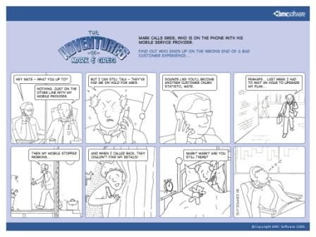
Following on from the success of ‘The Adventures of Mark & Greg’ technology leadership book, BMC Software decided to use the characters for an email direct marketing (eDM) campaign across the Asia Pacific region. Using a tightly worded script, I created eight illustrations to match the copy and worked closely with BMC and the design team to bring these illustrations to life in digital format for email distribution. The eDMs were sent out in Australian, Chinese Korean and Japanese versions.

Chinese eDM version

Chinese eDM version

Ogilvy PR APAC regional conference: presentation illustrations

Very Important Consumer: choice overload

Very Important Consumer: choice overload

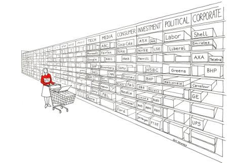
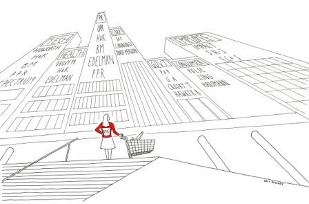
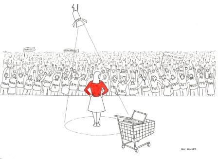
I was commissioned by John Studdert, managing director, Ogilvy PR Worldwide Australia to create three illustrations to accompany his key note presentation at a 2008 Ogilvy PR regional conference. The objective was to depict three scenarios where a consumer is faced with a flood of information and choices, whether that be which products and services to choose, which supplier to select and how employees have a wealth of options when choosing their career path. The illustrations I created were crisp, clean B&W ink line drawings showing a main character (wearing an eye-catching red jersey) faced with an ocean of choices.

Very Important Client: choosing a supplier

Very Important Client: choosing a supplier

Very Important Consultant: choosing the right career

Very Important Consultant: choosing the right career

BMC Software: ‘The Adventures of Mark & Greg’ book

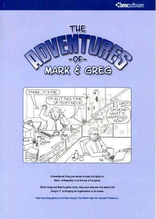
The Adventures of Mark & Greg

The Adventures of Mark & Greg

Technology jargon regularly helps people fall asleep. BMC Software recognised that IT language can sometimes have the opposite desired effect when describing campaigns, products or services.

So, to remedy this BMC Software crafted two central characters with everyday problems to spearhead a campaign on ‘business service management’. A storybook called ‘The Adventures of Mark & Greg’ was born (the idea of which was created and nurtured by Pip Livingstone and her team from BMC and written brilliantly by Richard Carter from Talkies in NZ). My job (a dream job) was to illustrate it — letting illustrations accompany the copy and helping readers visualise complex concepts in everyday scenarios.

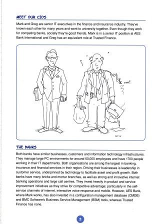
The book is based on the lives of two fictitious CIOs: Greg, who runs the IT in an error-prone technology organisation; and Mark, who runs a slick technology operation and tries to help Greg by sharing advice. The book underscored the very problems faced by CIOs every day and painted a vivid and real picture of BSM’s value.

In terms of ROI, the book was welcomed by technology media and the campaign has been promoted internally at BMC as a best practice case study. In addition, the book was adopted in BMC’s global new-hire programme. Every new BMC employee is given their own copy. BMC also created a ‘Mark and Greg’ video based on the book, used to support marketing activities.

In terms of industry recognition, the wider campaign picked up three awards at the PR Week Asia 2007 awards:

  • Best Technology PR Campaign of the Year
  • Best Regional (Asia Pacific) Campaign of the Year
  • Best Business to Business Campaign of the Year
Meet our CIOs: Mark and Greg

Meet our CIOs: Mark and Greg

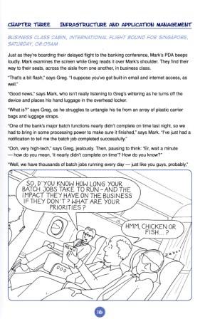
Business class cabin to Singapore

Business class cabin to Singapore

BMC Software: ‘The Continuing Adventures of Mark & Greg’ book

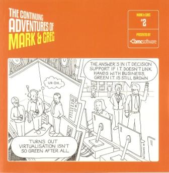
Cool Mark vs hapless Greg: second book front cover

Our CIO friends, Mark & Greg: second book front cover

Thanks to the massive success of the first BMC Software ‘The Adventures of Mark and Greg’, the BMC Software marketing team decided to do it all again. It was great to bring my characters back to life in a new story. Here’s the front cover illustration – this time the book was slightly smaller and designed to have a much slicker ‘look and feel’. I have also included a couple of chapter illustrations to show some of the visual detail I created in the story.

In short, this book carries on the story of two imaginary CIOs, the successful and organised Mark and the hapless and bumbling Greg. Both run the IT Department for competing banks but socially are good friends. In the latest book, Mark and Greg are recruited to help readers translate highly abstract ideas about IT management and Business Service Management. BMC Software used the book across multiple markets to educate and inform customers, partners, prospects, staff and media.

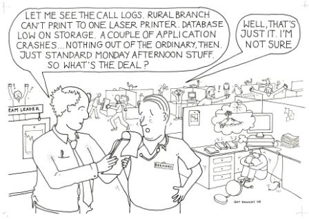
So what's the deal?

So what's the deal?

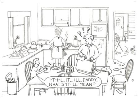
What's I-T-I-L mean Daddy?

What's I-T-I-L mean Daddy?

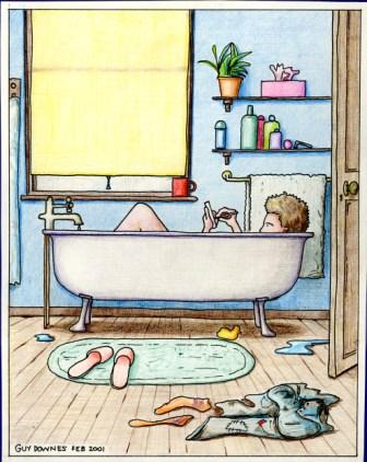
Shampoo, towel, talc, slippers, smartphone…

Get connected. Anywhere.

Get connected. Anywhere.

When Smartphones first came out (they were known as PDAs or Pocket PCs back then — I am showing my age…) I was really taken by the concept of being able to access information and stay connected to people no matter where you were. In 2001, I created a doodle which came to life as this illustration showing a person in the bath using their Smartphone. It’s probably not the best place to use an electronic device but I like the illustration all the same as it positions two objects in a location where they would never have existed if it wasn’t for the advance of technology. Checking email in the bath? Who would have ever thought.

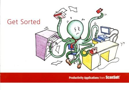
Scansoft: Get Sorted brochure

Drowning in data and paper? Scansoft can help

Drowning in data and paper? Scansoft can help

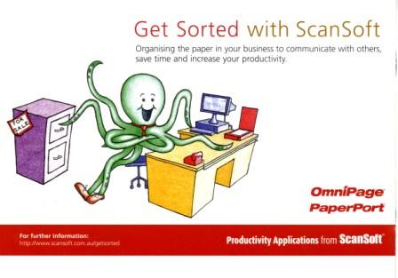
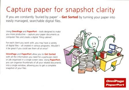
Whilst working at Howorth, Australia’s #1 technology and business communications specialist, I got the great opportunity to pitch some illustration ideas for a Scansoft point-of-sale brochure. It’s aim was to help small business owners understand how productivity applications can streamline operations. As SMB owners are juggling about eight things at once, I developed the concept of an Octopus trying (unsuccessfully) to multi-task. Through-out the brochure the Octopus is struggling with situations where Scansoft’s applications can help. The end illustration: Octopus is using Scansoft and he had ‘got sorted’. The brochure was used in leading electronic retail outlets. My illustrations were also used in an advertising campaign.

Buried by paper? Don't be.

Buried by paper? Don't be.

Got Sorted!

Got Sorted!

Microsoft at GSM World Congress: media invite cartoon

Communication: any time, any place, any device

Communication: any time, any place, any device

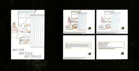
Getting cut-through with in-demand technology media in the UK can be a (very) hard slog. To help the Microsoft Windows Mobile PR team at Miller/Shandwick Technology (now Weber Shandwick) capture the attention of media they were targetting for GSM World Congress 2001, I created this illustration invite, which formed the basis of an email invite. My unique illustration was animated digitally to catch the journalist’s eye (the image above shows the still frames of the 10-15 second email).  The accompanying copy provided information on Microsoft at the event and how media could secure their spot.

Broken leg? Pocket PC? No worries then.

Broken leg? No worries with a Pocket PC

Parker & Partners: election tarrot card invite

Rudd vs Howard: the tussle to be 'Emperor'

Rudd vs Howard: the tussle to be 'Emperor'

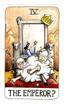
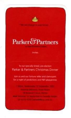
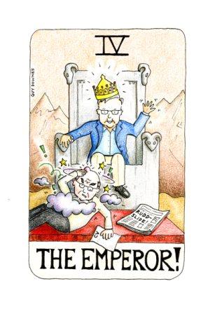
Parker & Partners (an Ogilvy PR Worldwide company) is one of Australia’s leading bi-partisan public affairs specialist. In 2007 I created this election tarrot card illustration, which doubled as the back of P&P’s invite to politicans, media and advisers for P&P’s annual Canberra Christmas Dinner. The event was held a little early, ie September, to beat the poll. The theme of my invite and the event was fortelling the future. Fortune tellers and tarrot card readers were also on hand at the event to let MPs know if they are to win or lose in November and my illustration was also enlarged and projected on the venue walls.

P&P Christmas Dinner: a night of predictions

P&P Christmas Dinner: a night of predictions

Parker & Partners: invite follow up

The Emperor: Howard gets hit by the Rudd-slide

The Emperor: Howard gets hit by the Rudd-slide

After the 2007 election when Labor had secured victory, I followed up my initial Parker & Partner Christmas invite illustration with the actual outcome  of the tussle to be ‘The Emperor’. ‘Kevin 07’ had become a reality. This cartoon illustration was posted on the P&P blog accompanying news of the election results.

Your Health newsletter: I love my GP

Your Health: I love my GP

Your Health: I love my GP

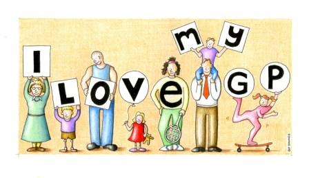
I was invited to pitch some illustration ideas to Your Health newsletter thanks to the (inspirational) Richard Sauerman http://wakeuptiger.blogspot.com/ This is my illustration that made the cut for the newsletter’s direct marketing campaign to GP’s across Australia. It’s one I really like as the illustration is simple, eye-catching with a strong message. I got repeat business on the back of this effort, which was great. You may have heard about Your Health: it’s a neat, interesting health newsletter that you’ll most likely spot at your local GP in the waiting room. For more info: http://www.yourhealth.net.au/

Your Health

“Our Family GP Cares”

cs-yourhealth

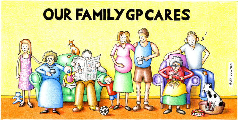
Working for Your Health newsletter, my illustration featured on a direct marketing postcard mailed out to GPs. The aim was to create an eye-catching illustration that stood out when it landed on the GP’s desk.