Illustrations

What are they?

Unique hand-drawn illustrations and posters bursting with colour and images can provide an eye-catching way to quickly summarise or accompany written or textual information.

Why use them?

In a data driven world where we are overloaded with information, documents and words, traditional illustration can help cut through complexity, get attention and humanise abstract or complicated issues. They can also make people think and smile. The more we move towards all things digital, the more magical traditional illustration becomes.
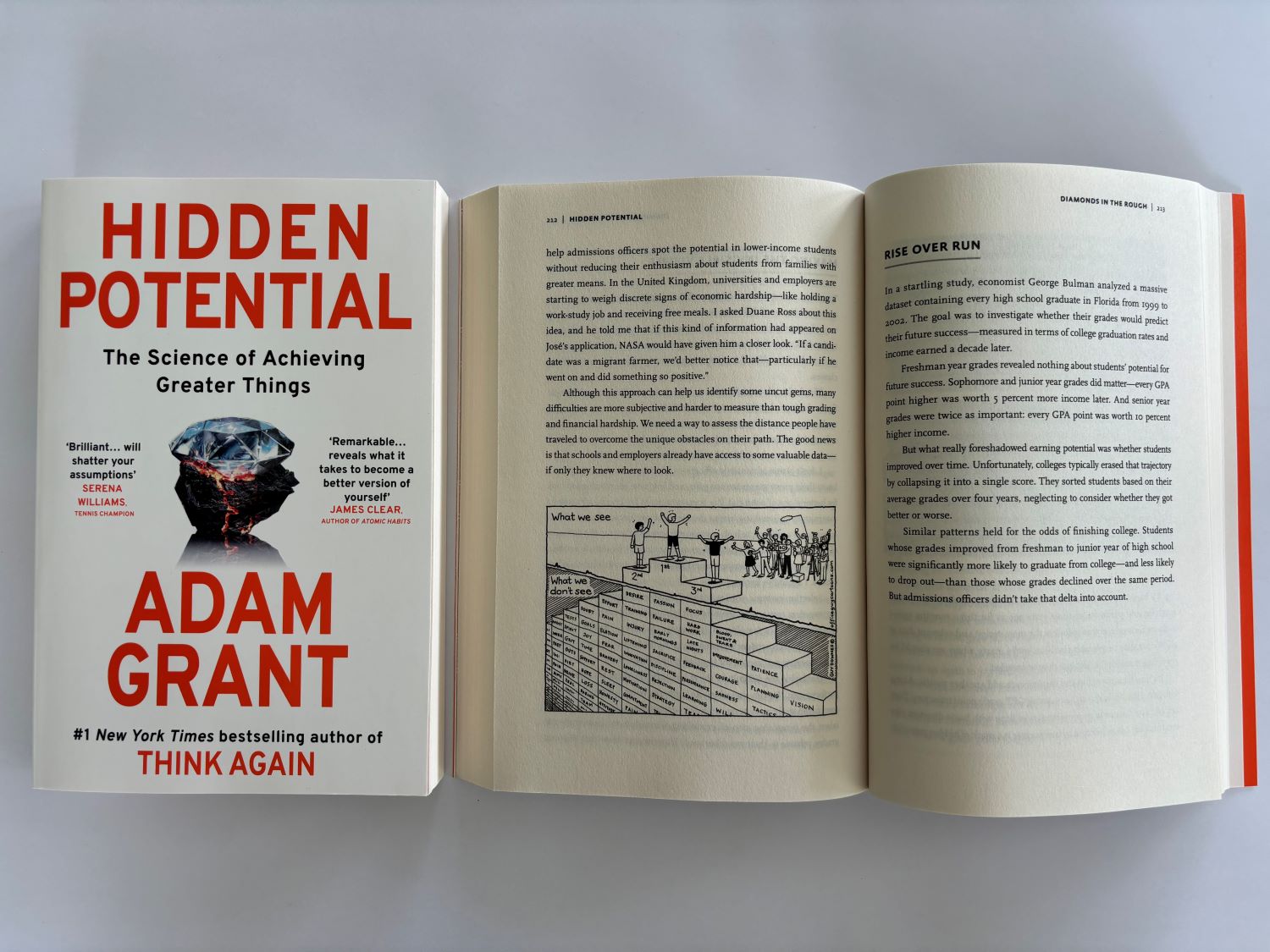
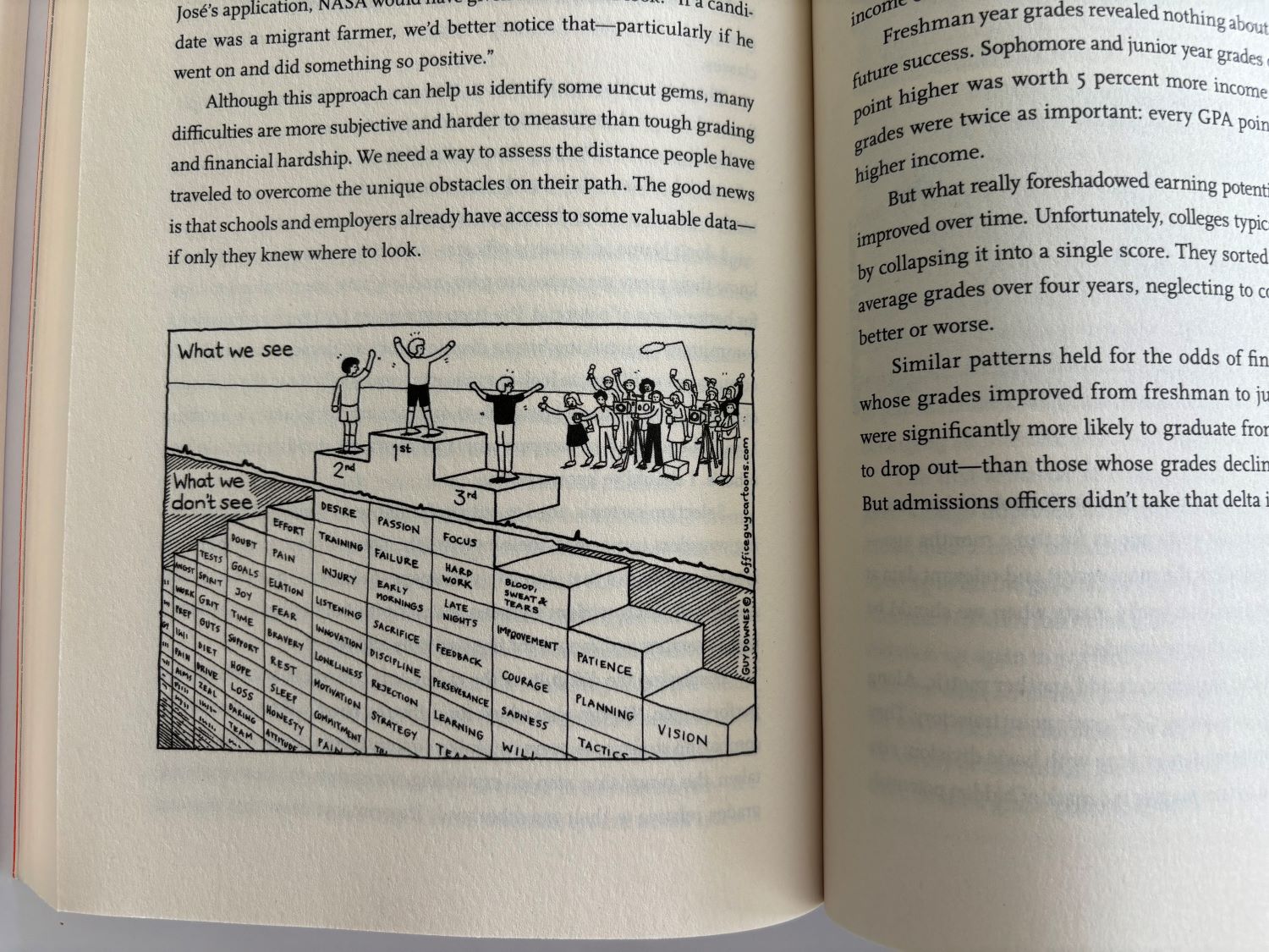
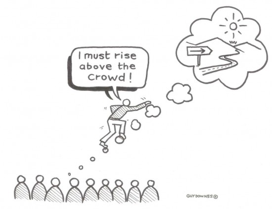
Top author, Adam Grant, features my cartoon in his book, Hidden Potential.

One of my most popular and best-selling cartoons, Podium Finish, is featured in Hidden Potential. In his new book, organizational psychologist and best-selling author, Adam Grant, ‘illuminates how we can elevate ourselves and others to unexpected heights’. Again, a big thanks to Adam for liking and selecting my work. You can find out more about the book here: Hidden Potential – Adam Grant To take a closer look at my featured cartoon, click here: Podium Finish – Office Guy Cartoons 

Adam Grant’s work explores the science of motivation, generosity, rethinking, and potential. For more information on Adam, check out his website: Adam Grant – Books, Podcast, TED Talks, Newsletter, Articles

Make your content more captivating with cartoons and illustrations

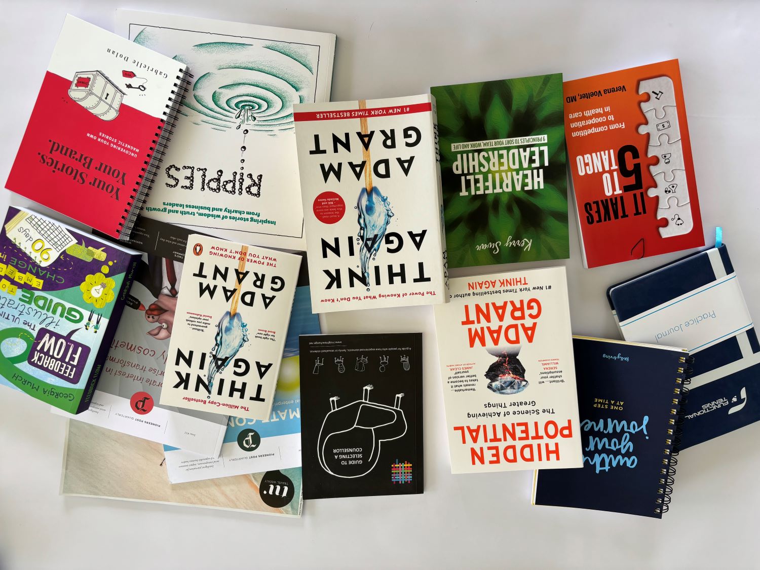
This photo shows a good sample of books, magazines and journals where my pre-drawn or bespoke cartoons and illustrations have been used recently. Cartoons can captivate, add clarity, pose questions or simply help make people smile. Consider using cartoons in your next piece of content, whether that’s a book, an article, a blog or a presentation or something entirely different.

You can check out my cartoons here:  www.officeguycartoons.com  


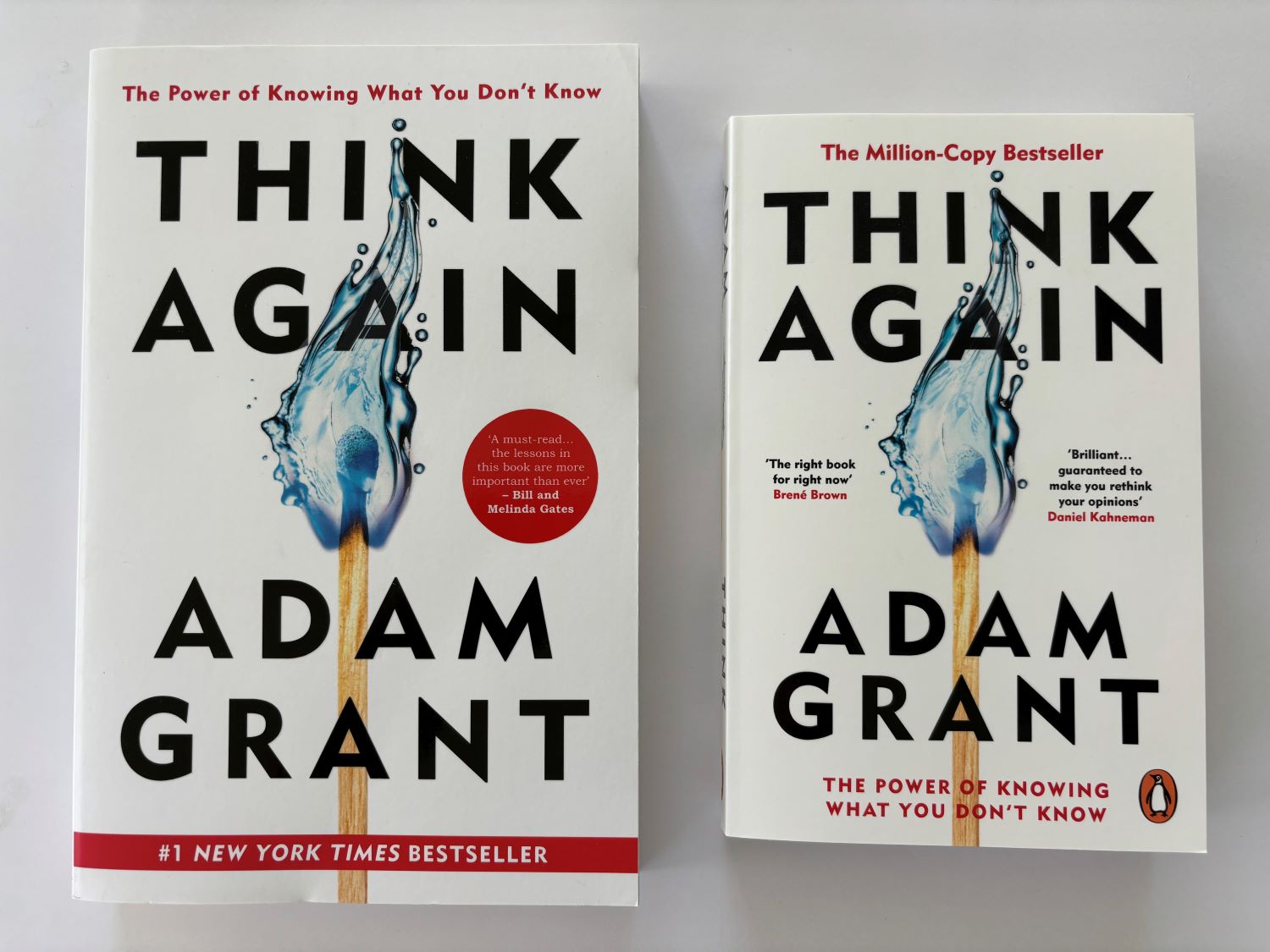
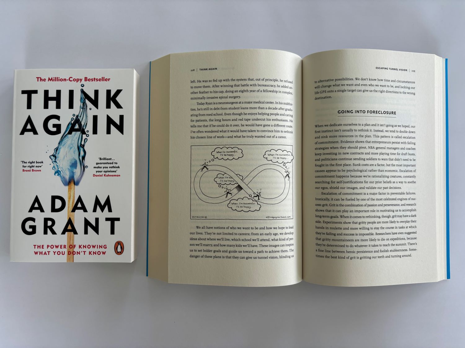
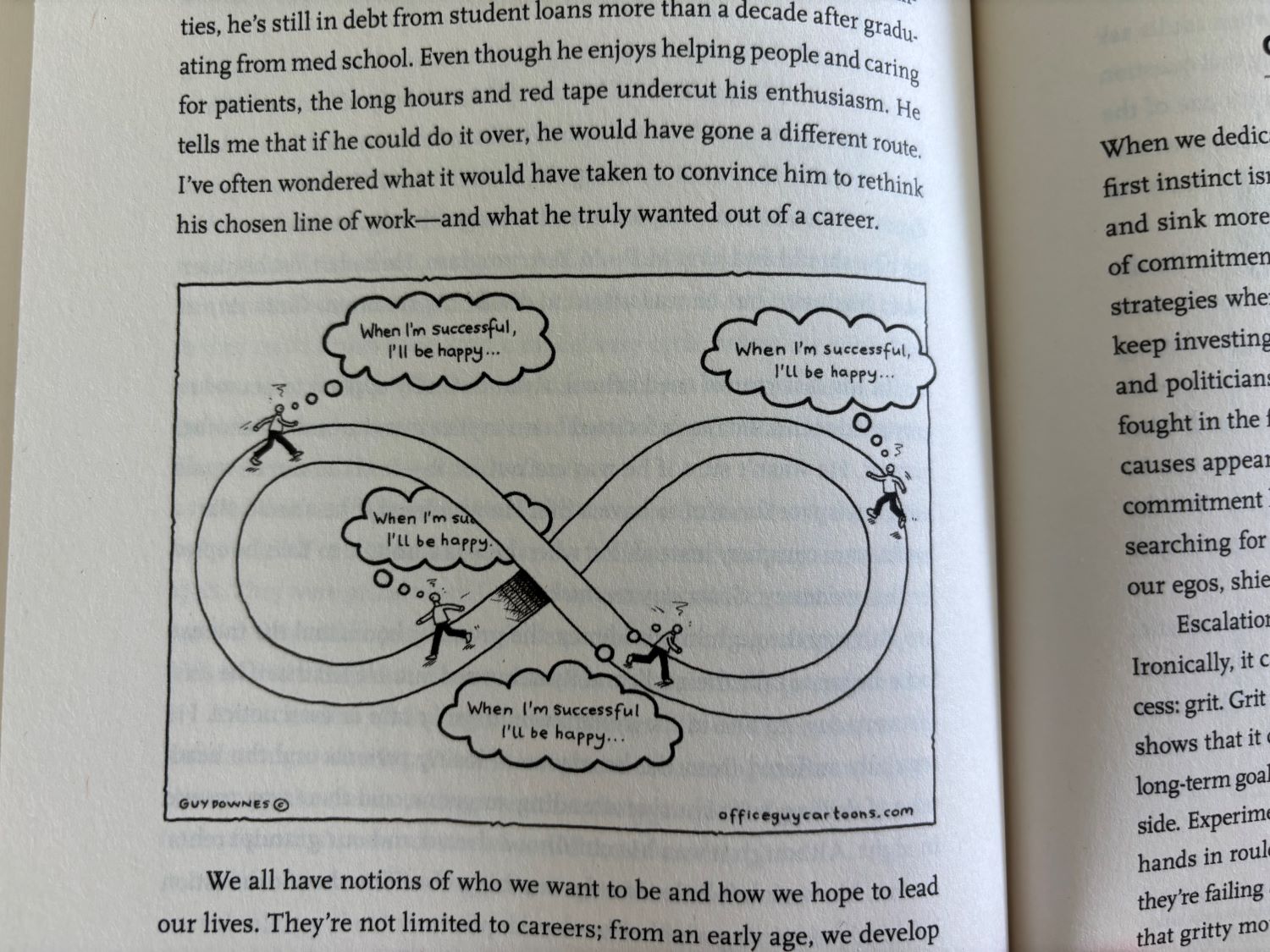
One of my cartoons is in Adam Grant’s best-selling book, Think Again.

One of my cartoons featured in Adam Grant’s million-copy best-selling book: Think Again. Adam’s book ‘examines the critical art of rethinking: learning to question your opinions and open other people’s minds, which can position you for excellence at work and wisdom in life’. A huge thanks to Adam for picking one of my cartoons. You can find out more about the book here: Think Again, the latest book from Adam Grant To take a closer look at my featured cartoon, click here: When I’m successful… – Office Guy Cartoons

Adam Grant is an organizational psychologist and bestselling author who explores the science of motivation, generosity, rethinking, and potential. For more information: Adam Grant – Books, Podcast, TED Talks, Newsletter, Articles


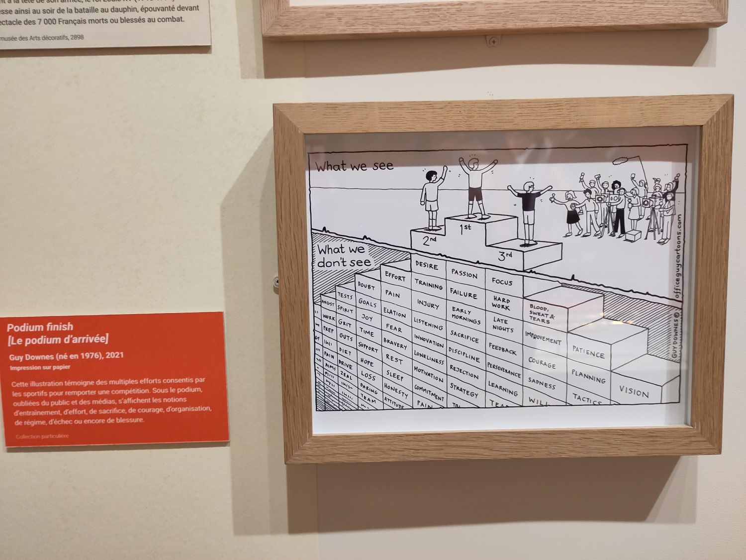
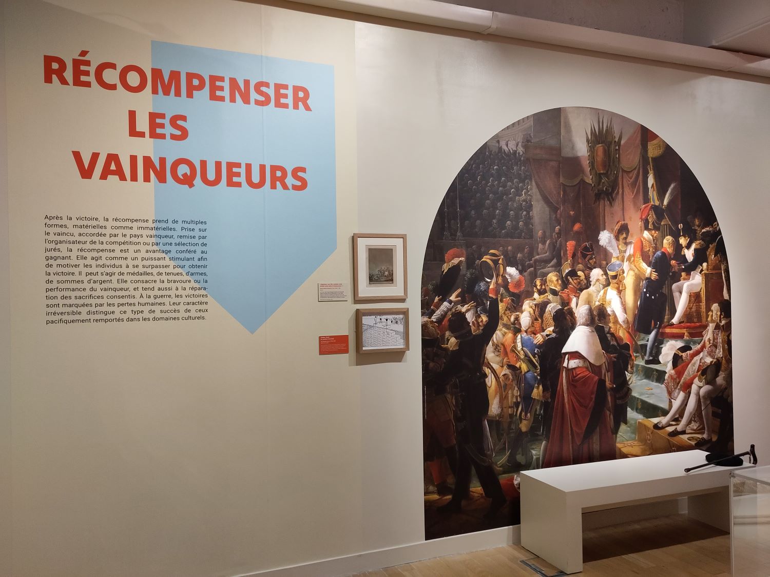
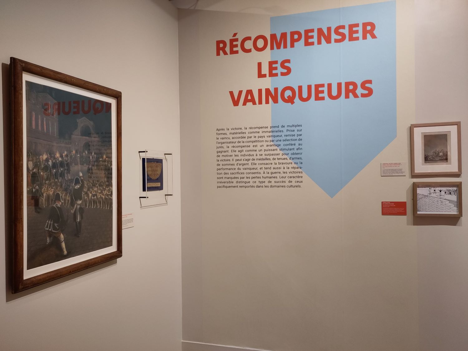
My ‘Podium Finish’ cartoon exhibited at the Musée de l’Armée, Paris.

With the Olympic and Paralympic Games taking place in Paris is 2024, the Musée de l’Armée devoted an exhibition to the notion of Victory and the various ways in which women and men have experienced, celebrated and embodied it across the world and history. My cartoon was displayed to show the hidden effort and sacrifices sportspeople make well before they succeed – most of this struggle and commitment is hidden and unseen. To take a closer look at my featured cartoon, click here: Podium Finish – Office Guy Cartoons To find out more about the exhibition, take a look here: Victory! The Making of Heroes – Musée de l’Armée (musee-armee.fr)

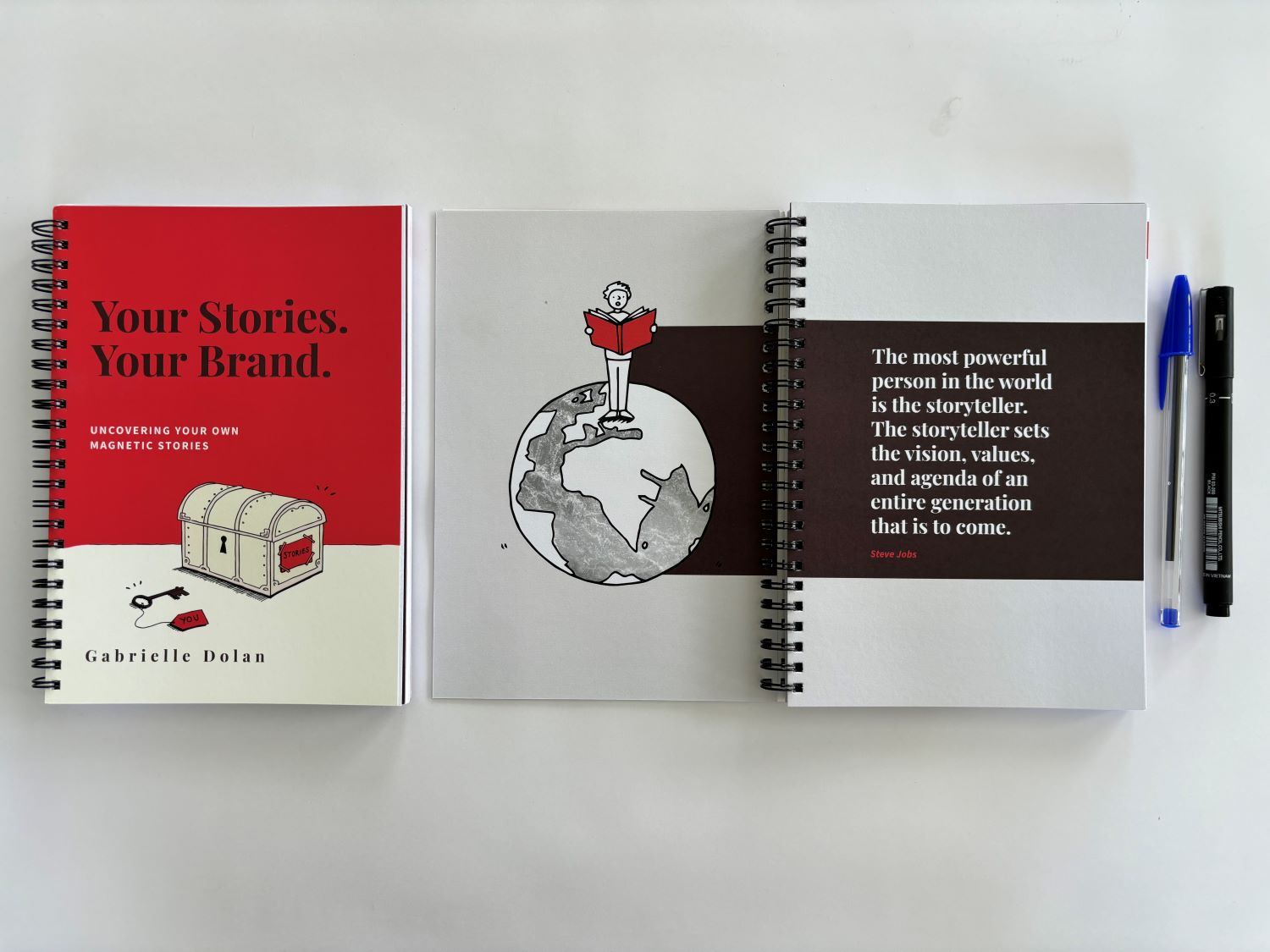
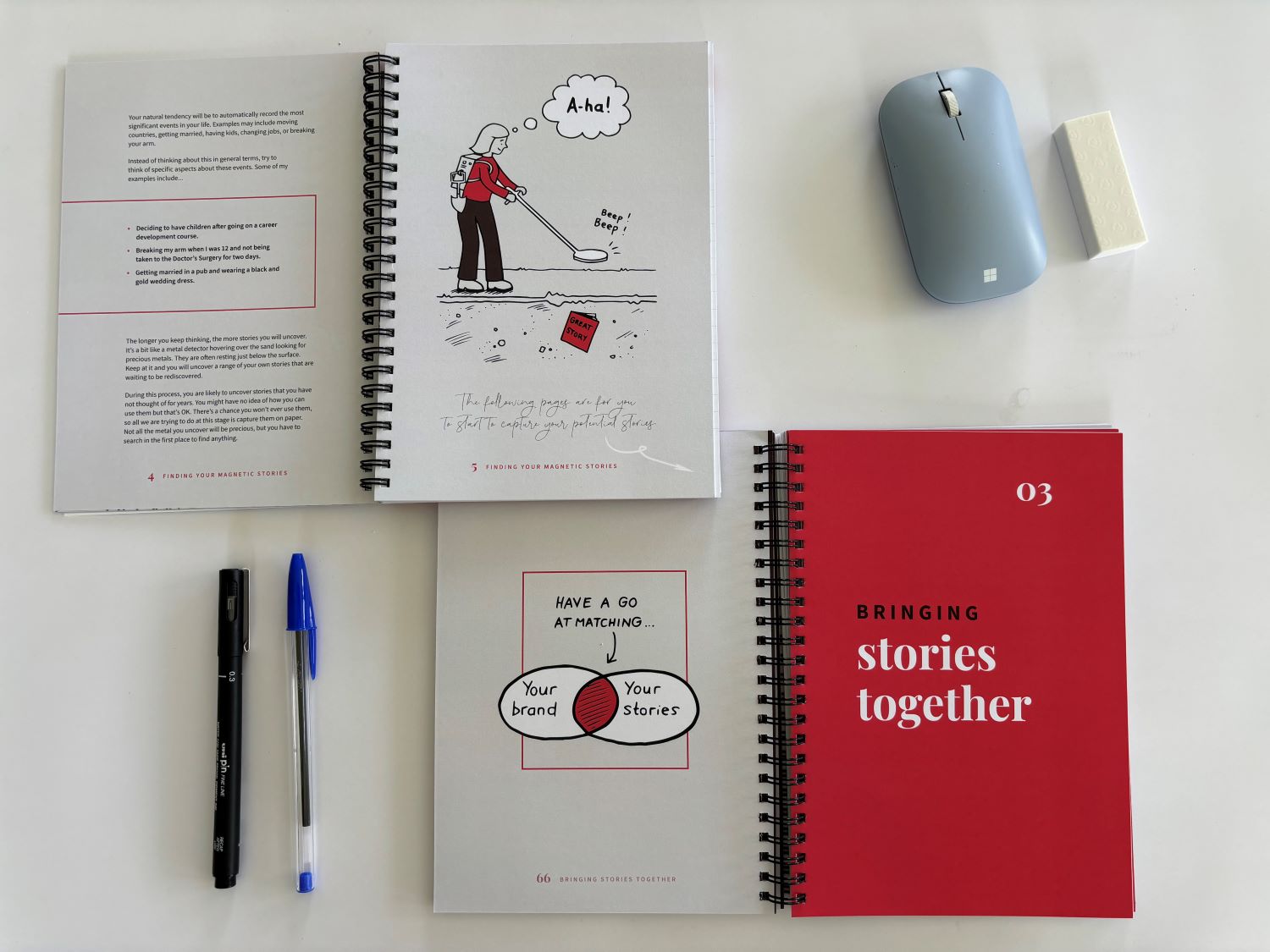
Illustrating the ‘Your Stories, Your Brand’ creative workbook

I illustrated Gabrielle Dolan’s ‘Your Stories, Your Brand’ creative workbook that helps people discover and build their own engaging stories. Gabrielle is an expert in strategic storytelling – she brings a human element to corporate communication helping executives find stories that connect with their audiences in a meaningful way. For more information on Gabrielle, visit: Gabrielle Dolan can tell you a story or two – Strategic Storytelling…

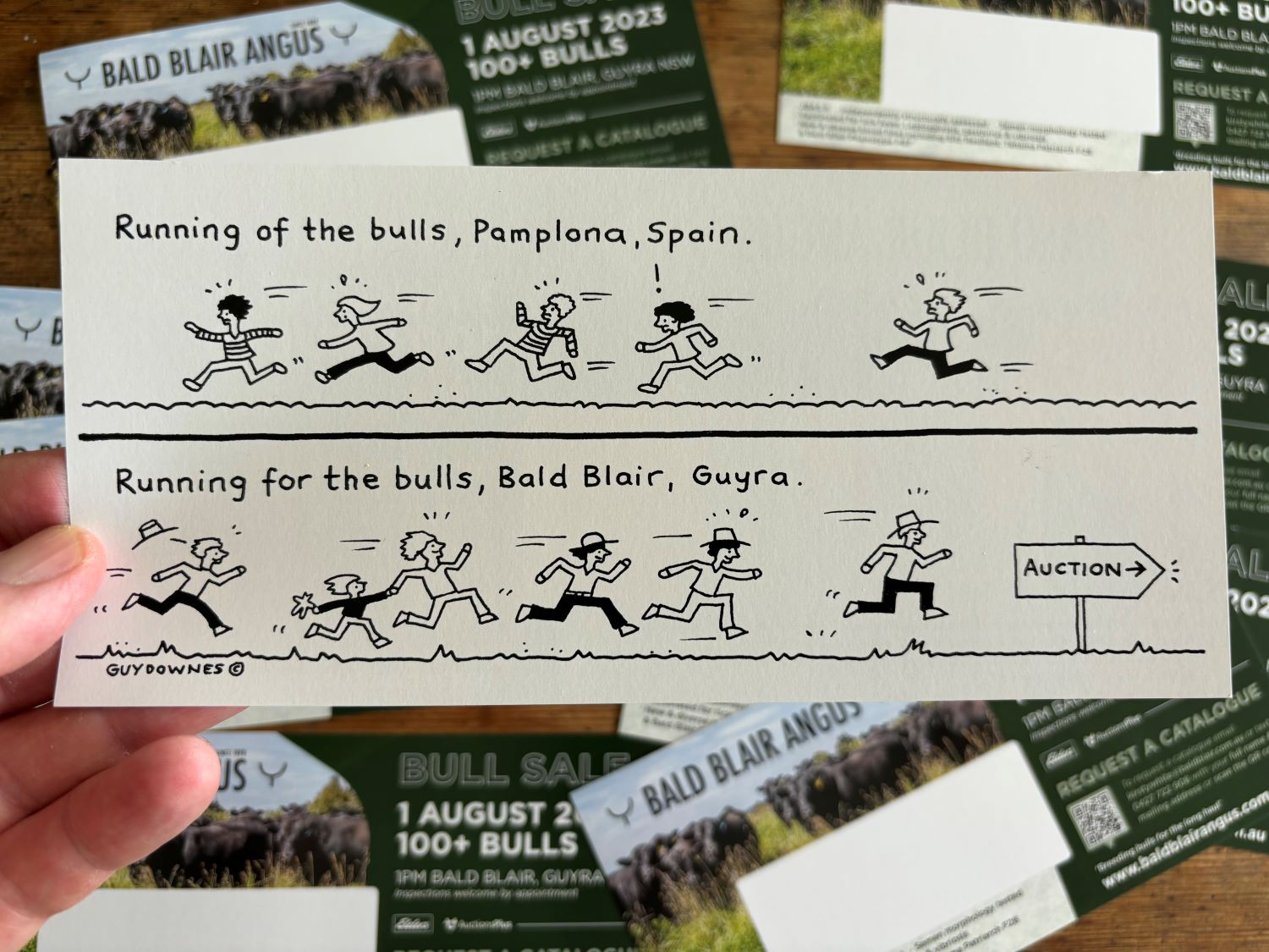
Creating a unique cartoon for Bald Blair’s Bull Sale postcard

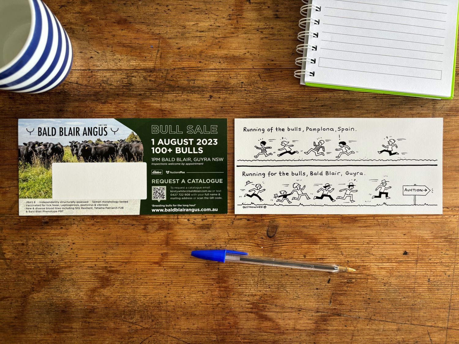
Bald Blair is famous with Angus cattle breeding in Australia with more than 110 years knowledge and experience with the breed. I illustrated this creative and fun cartoon that featured on one side of a postcard that the Bald Blair marketing team sent out to hundreds of key contacts in the run up to their August 2023 Bull Sale.  The aim of the hand drawn cartoon was to do things differently, grab attention when people sorted through their mail and, hopefully, make them smile. For more information on Bald Blair, take a read here: Bald Blair Angus

Look – it’s your book!

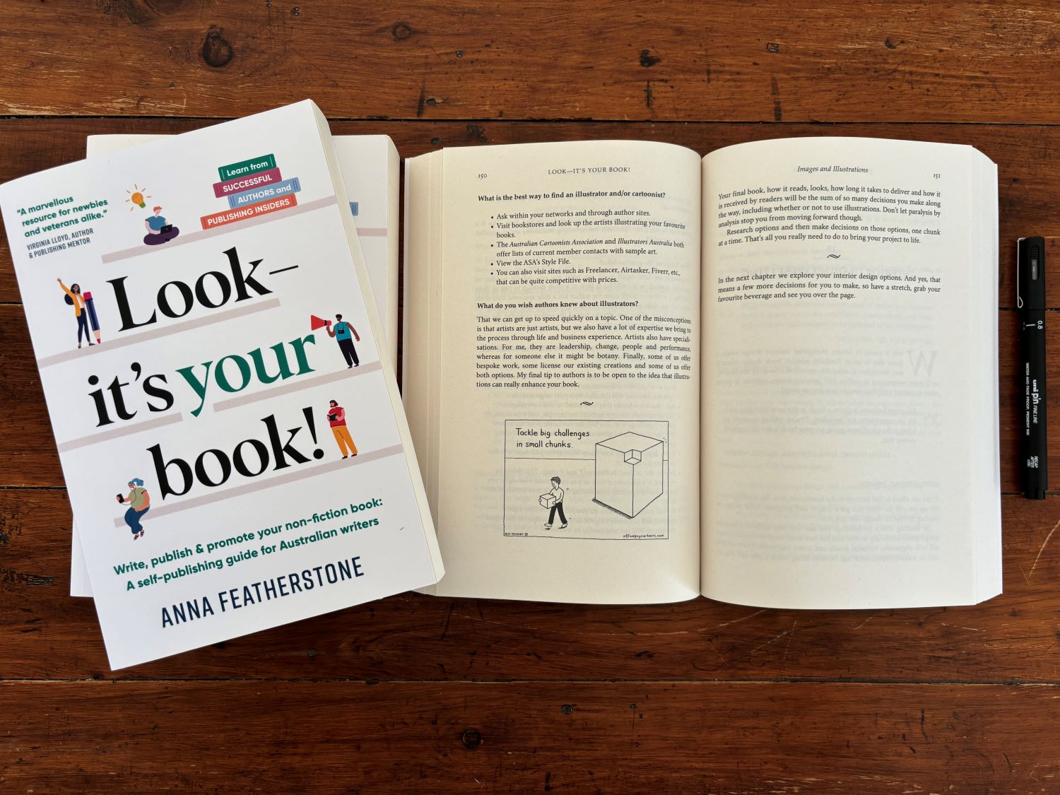
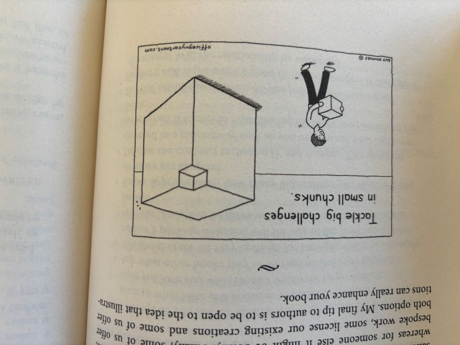
 It was a delight to help out leading author, Anna Featherstone, on her book: ‘Look – it’s your book!’ It’s the most comprehensive book on self-publishing for Australian writers and it is also a great resource for traditionally-published authors who want to capitalise on the marketing of their book and leverage new income streams. I contributed a chapter on what to consider when working with an illustrator and a couple of my cartoons were featured as well. For more information, check it out here: “Look – It’s Your Book!” A self-publishing book for Australian writers by Featherstone – Official website (annafeatherstone.com)

Insight Exchange: Guide to selecting a counsellor

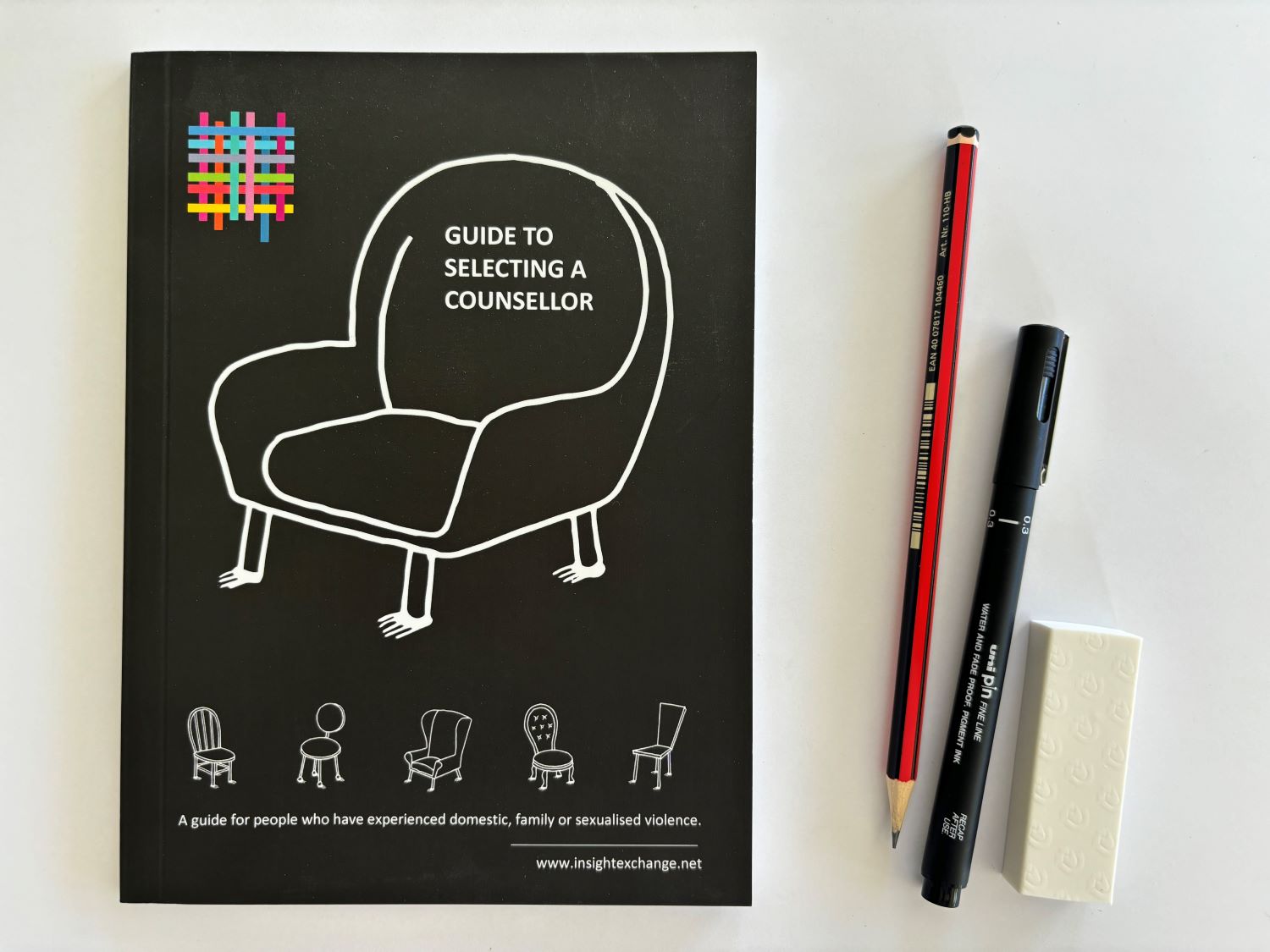
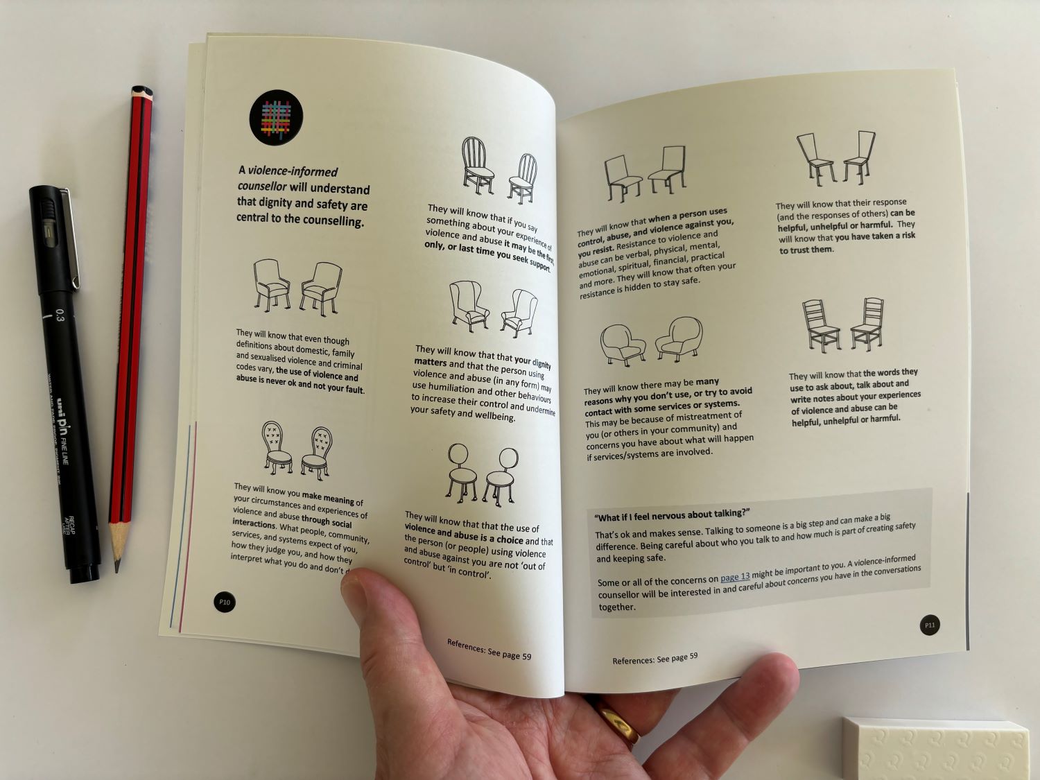
Working closely with the team at Insight Exchange, I illustrated their guidebook to selecting a counsellor for people who have experienced domestic, family, or sexualised violence.  The guide is designed to support someone in their selection of a counsellor and to support their reflections about the value and safety of the counselling experience. You can view the full guide book here: PowerPoint Presentation (insightexchange.net)

One of my cartoons found… in Found Regional magazine

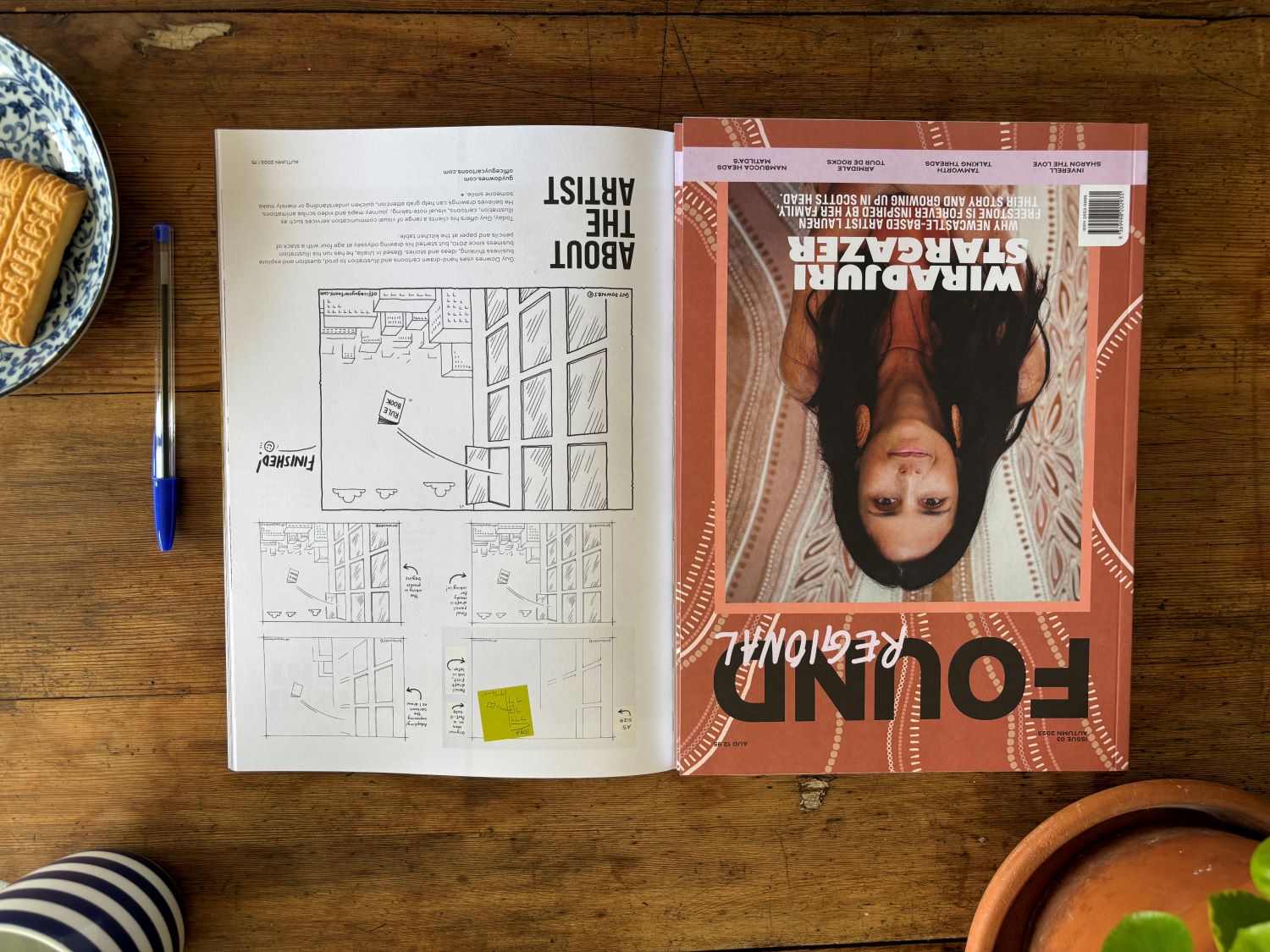
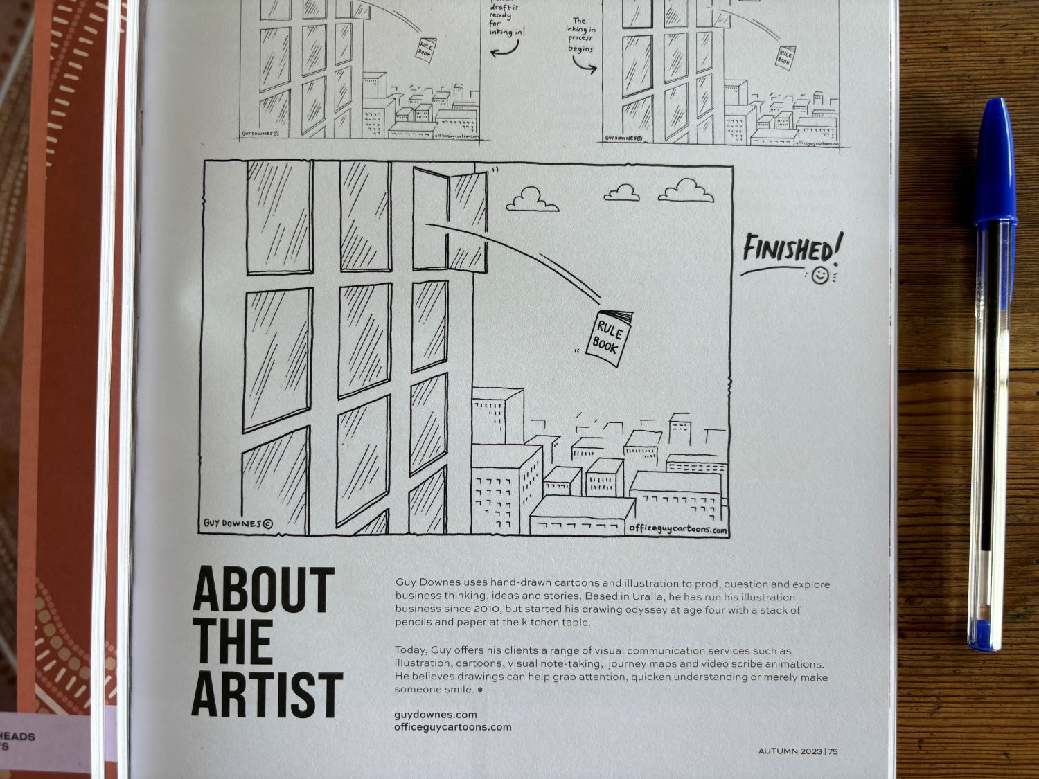
Found Regional magazine dedicated a full page to show the creative process I go through to create one of my hand drawn cartoons, titled ‘The Rule Book’. I provided snaps of the development process on my drawing board: from idea creation to the draft and onwards to the final inked version. If you like the cartoon, you can see the original version here: The Rule Book – Office Guy Cartoons Found Regional ran an online feature on me as well about why I draw and how I started cartooning – take a peak here: Behind the Lines with Guy Downes — FOUND Regional

Discover, dream, design, deploy: a reflection planner to reach your goal

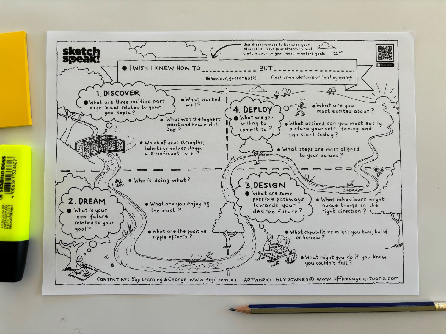
Sometimes you need to sit down, think about a key goal, and work it through from imagination to reality with a trusty pen and piece of paper. To help you do this, working with innovative consultancy, Soji Learning & Change, we’ve created a visual frame based on Appreciative Coaching, that you can use as a reflection tool and self-coaching resource. This gift to you allows you to harness your strengths, focus your attention and craft a path to your most important goals. To get one, visit this link to read more about the process to follow and download your copy: Like a River, Craft Your Path: Appreciative Coaching Resource | Soji – learning and change


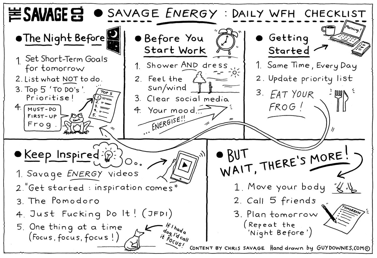
Struggling with WFH? Check out this daily action planner.

Working From Home daily action planner.
Working from home can be tough. You need a simple plan to help tackle each day with pace, hope and fun. Teaming up again with leadership, marketing and advertising doyen, Chris Savage, I illustrated Chris’s great checklist to make the most of working from home each day. Download the planner, keep it close and then read Chris’s brilliant explainer on how to use the checklist. You can read it here. Stay safe and good luck!

Free Business Action Plans in Time of Crisis

Free Business Action Plans in Time of Crisis

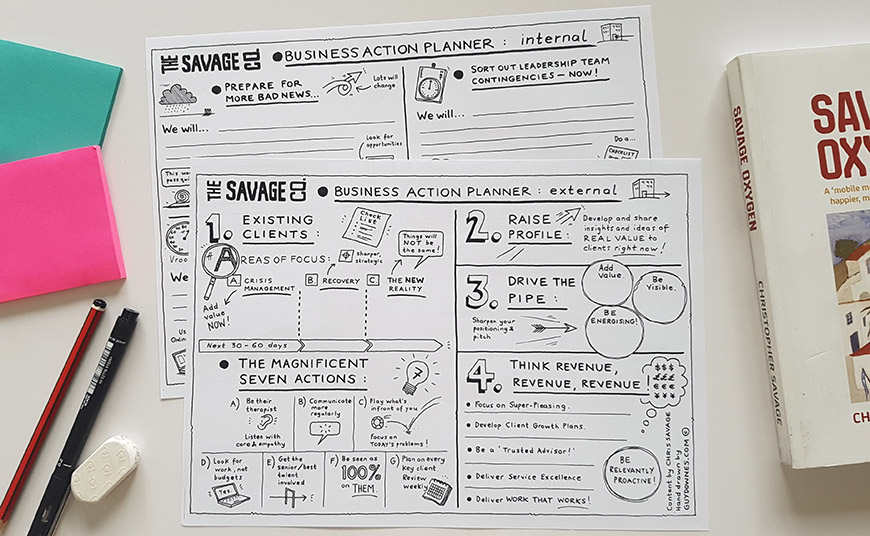
In times of massive change, a simple plan and structure can sometimes make a difference. So, here are two free ‘Business Actions Plan’ worksheets designed to help you and your business navigate through these very rough times. Feel free to print them out and get cracking.

I worked with Chris Savage to turn his headline tips from 37 years of agency leadership experience into these visual one page plans. It’s a free guideline chart to help you take the right actions – today and tomorrow. One is for Internal actions – getting your business ‘house in order’. The second is for External actions – keeping super-close to existing clients, driving the pipeline, etc. Develop your own plans and actions for each section. Take action every day. Update as required.

If you’re interested in proven ideas to help manage agencies and teams through massive disruption, you can view the Business Action Planners by clicking on the link below. Please feel free to share these Business Action Planners with your clients, colleagues and wider business network if you think they can be of value.
 

Download the Business Action Planners here:

thesavageco.com/free-business-action-plans-in-time-of-crisis
 

Chris Savage is the founder of Ogilvy PR, a former chief operating officer of STW (now WPP AUNZ), and today is CEO of growth advisory firm, The Savage Company. Chris has been part of teams that successfully led agencies through the 1987 crash, 1990s recession, and tech bubble burst of the early 2000s. He was chief operating officer of the 4,000 people strong STW (now WPP AUNZ) following the 2008 global financial crisis (GFC).

Author Your Journey: One Step at a Time

Kelly Irving Author Your Journey
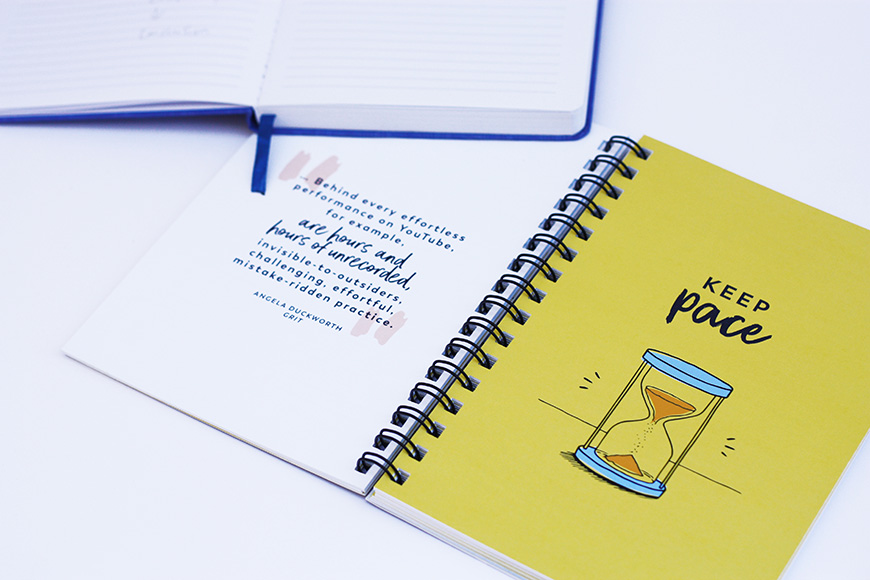
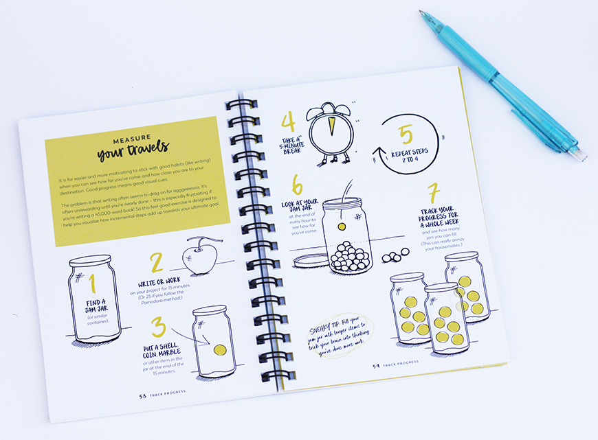
I recently worked with Kelly Irving to provide the illustrations for her interactive book that helps people to write work that matters. The ‘Author Your Journey’ journal is for productive people and writers in all genres, but particularly useful for non-fiction and business. It’s a great tool for authors of books, white papers, articles, blogs, LinkedIn posts, thesis, reports, or, even, emails. It’s packed full with useful advice, tools, tips, quotes, writing exercises and illustrated resources to guide you on the adventure from writing idea to implementation. It was a joy to work with Kelly again and bring so many areas of the journal to life with my hand drawn illustrations. Kelly is one of Australia’s best writing and book coaches. She is the go-to-editor for people who want a partner to produce their best work and to create a book that has impact and influence. The journal was also beautifully designed by Ellie Schroder who is graphic designer based in Melbourne.
Kelly Irving Author Your Journey

Using sketches to grow campaign ideas and spark great client conversations

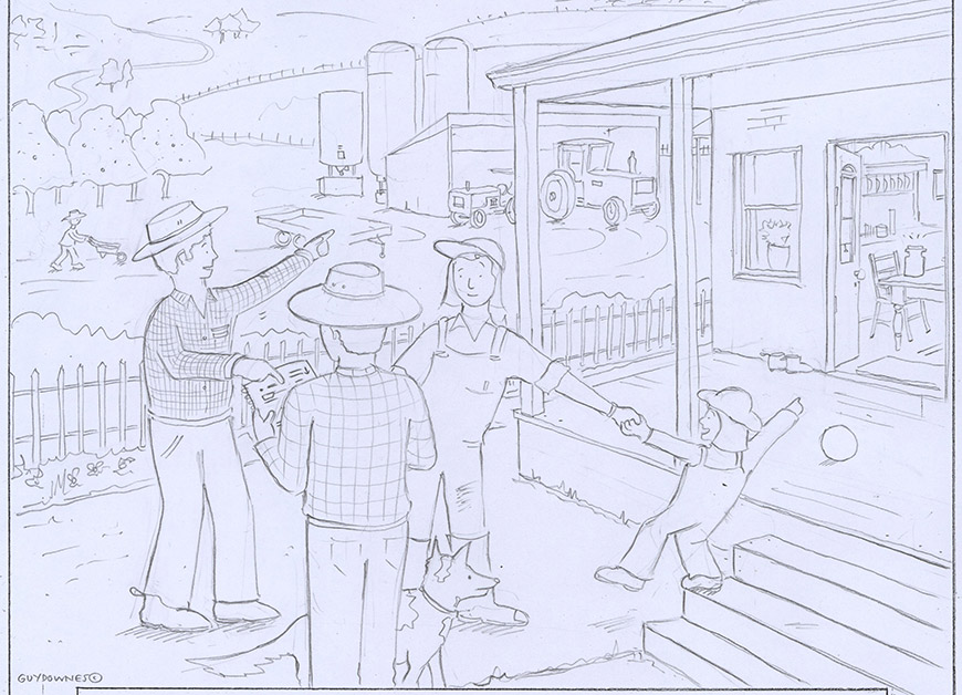
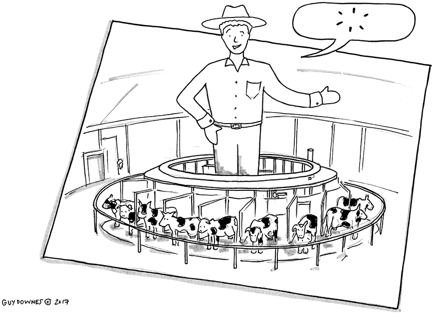
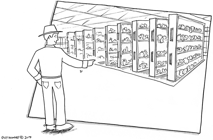
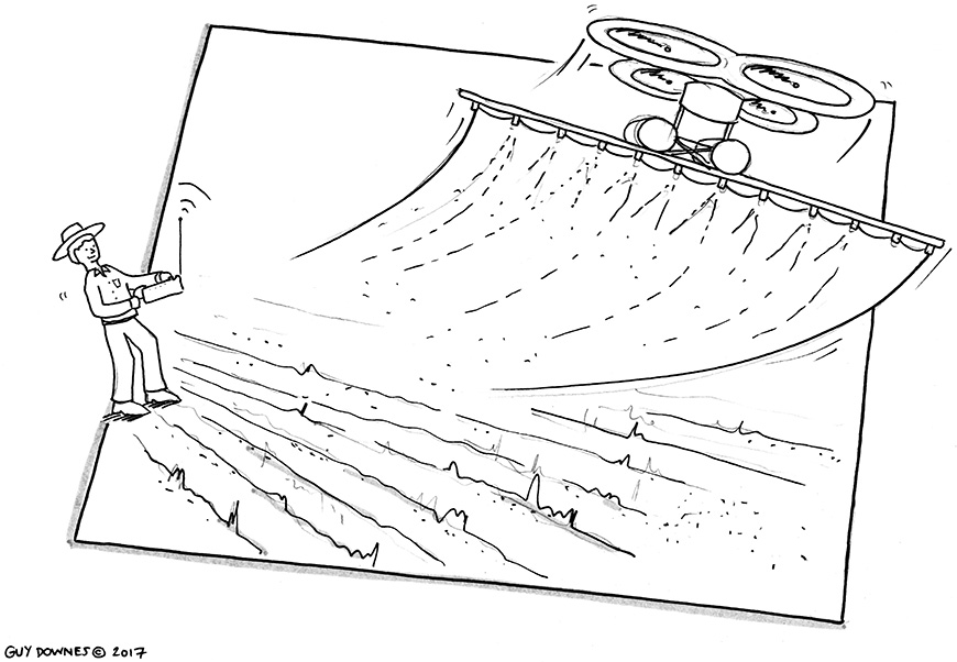
Ag Storytelling 1Over the past two years, I’ve been doing some interesting illustration and storyboard work for C7EVEN Communications. They’re a smart and rapidly growing communication and marketing agency based in Tamworth (NSW) and Sydney that connects its clients with audiences in regional and rural Australia.Ag Storytelling 2At their heart the C7EVEN team are great storytellers and, from time to time, when they’ve needed to bring a concept, campaign or story idea to life visually in front of their clients they’ve picked up the phone and given me a call. You’ll see a sample of my pencil and ink storyboard work for the team in this blog post – each piece was used to introduce a campaign idea and start a discussion with a client.Farm Concept 1Interestingly my work has not been used for a final or external campaign but in the earlier planning stages where getting conversation momentum around an idea is important. What I love about this is that the C7EVEN team look to visuals, sketches and pictures to quicken understanding, foster alignment and spark conversations around their thinking. Plus, when my sketches have been printed out on big boards or paper, it gives the C7EVEN team something tangible thing to discuss, pass around and touch in meetings.This is for me is a unique and fresh approach and ties in with what motivates me: using authentic, hand drawn pictures to open minds to a seed of an idea and at the same time start good conversations.Farm concept 2P.S. The C7EVEN Instagram account is worth a follow. If you’re a rural tragic like me, their ‘on-and-off the road’ photos will take you to some amazing and remote places right across regional Australia. Check it out here: instagram.com/c7even_commsFarm concept 3
Illustrating ‘Feedback Flow’: a visual business book on embedding a feedback culture

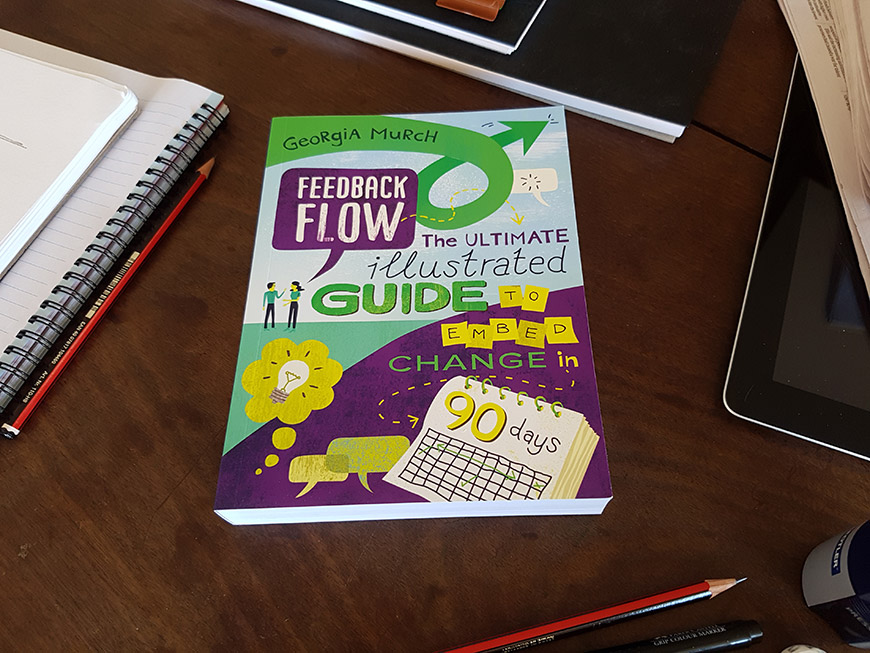
Feedback FlowIllustrating written work that has energy, insights and stories that jump off the page is a joy. This was the case when I illustrated Georgia Murch’s latest business book: ‘Feedback Flow – the ultimate illustrated guide to embed change in 90 days’. Georgia is a leading expert in designing feedback cultures for organisations across Australia helping them build trust and respect through conversations. www.georgiamurch.com
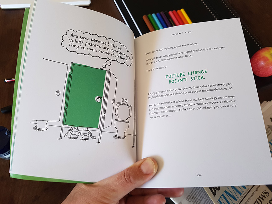
Today, leaders want to create high-performing teams, cultures, products and services that ripple throughout their business and into the market. 
But what is required to do this? How should they go about it?
 This straight-talking illustrated book shows readers how to create lasting change and become the feedback culture that people love working in and for. A feedback culture that not only sticks, but flows.Feedback FlowGeorgia has worked with public and private clients for over 20 years, leading teams and businesses, designing and facilitating culture change and leadership programs. Georgia truly appreciates the diversity and challenge of complex workforces and the intricacies of managing a business while leading change.Feedback FlowThe illustration process was very rewarding and I created well over 100 unique hand drawn illustrations for the book. I spent many hours over my drawing board, reading, drafting and tinkering with concepts and ideas. I worked closely with Georgia and her super team of Kelly Irving and Ellie Schroeder. Kelly is a highly sought after editor for people who want a partner to produce their best work and to create a book that has impact and influence. Kelly has been behind some of the best sellers you’ll have come across in book shops right across Australia. www.kellyirving.com And Ellie? Well, in my mind, she is one of the most talented designers I have been lucky to work with. You can see her blog post on Georgia’s book here. But don’t stop there – do spend some more time exploring her website. There is definitely magic in her approach and expertise. www.ellieschroeder.comFeedback FlowHere’s what Georgia had to say about my illustration work for her business book:
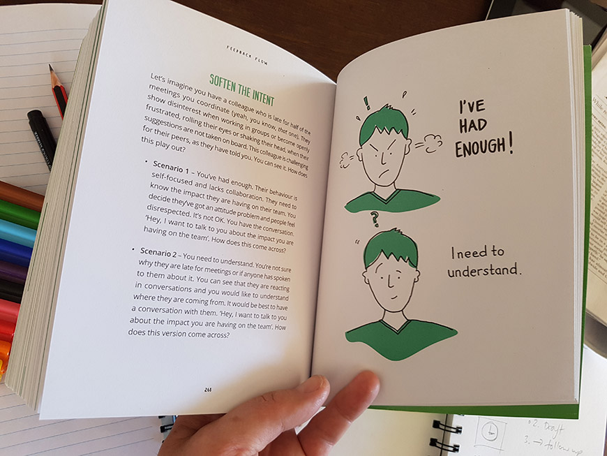
“Guy Downes, you are one legendary illustrator! It’s always such a ride working with you when you’re capturing the visuals for workshops, but this book took it to the next level.” Georgia Murch, Feedback & Cultural Change Expert, www.georgiamurch.com

Raising health and safety awareness among business leaders using an illustrated story map

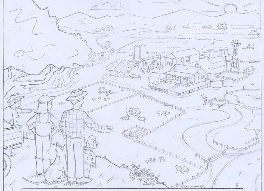
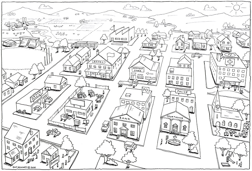
Leaders Visual FrameSoji Learning & Change work with hundreds of business leaders across Australia every year by delivering unique learning and change programs. A while back they got a brief to help one of their clients refresh a safety learning program for leaders. The brief was to improve workshop engagement and creating a stronger connection to the importance of safety in the organisation. As part of the design they built an innovative exercise that combined visuals and storytelling.

The group activity used a eye-catching yet simple illustrated map of a country community typical to where the organisation operates. Each group was then asked to use the visual as a prompt for discussion and story sharing. They talked about the system impact of accidents and injuries and the negative effect injuries can have on a community over time. This in turn led the teams to have conversations during the workshop about their work, health & safety responsibilities and the positive actions they could take forward.
Who drew the map of the country town? Yes, you guessed it. It was a wonderful brief as I was allowed to imagine what this bustling, cosy country town would look like. Knowing that this simple illustration could help play a part in getting employees home safely every night certainly made the whole process even more meaningful. A small drawing with a big heart. Now that’s work I love. For more information on Soji Learning & Change, please visit: soji.com.au

Adding drawing goodness to Savage Greatness!

Savage Sell

Photo Source: Vanessa Raath

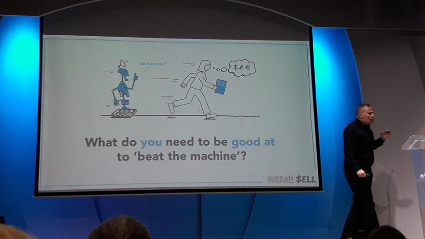
Since early 2016 I have been incredibly lucky to provide business illustrations to two industry gurus. They are Greg Savage and Chris Savage. And every year when they hit the road on their ‘Savage Speaker Series’ in the main cities across Australia, New Zealand, UK and South Africa, it’s been my hand drawn illustrations that pop up on their presentation slides. I work hard to provide simple yet eye-catching, relevant and memorable little cartoons to support the blend of recruitment and professional services lessons, learnings and insights they provide on the big screen and from the stage.
Savage SELL

Photo Source: Greg Savage

So far, thousands (and I mean thousands) of business leaders, managers and employees have packed out auditoriums to grab the ‘gold’ that Greg and Chris have been sharing across their first three speaker series. To date, the speaker series have been:

Savage Growth – Powering Profits in Disrupted Times: ‘New competition, client and candidate expectations, technology, delivery channels, financial models. Yet conditions are perfect to differentiate, pull ahead of the market and explode profit growth’.

Savage S.P.R.I.N.T – The Six Pillars of the Future Fit Recruiter: ‘100 proven tips, tools and tactics to drive billings’.

Savage SELL: ‘Machines will do hackwork, process and drudgery. You, the human, must be brilliant at what machines cannot do! And machines can’t sell. To drive sales success in this ‘new world’ of recruitment… you must learn to Savage SELL!’

Savage SELL

Photo Source: Ali Moroane

Each speaker series format is a fast-paced 4-5 hour intensive yet fun workshop. Each workshop is made up of fresh content, providing a proven blueprint on every facet of leading-edge sales and business.

If you don’t know about Greg or Chris, start today, right now, this minute. I highly recommend you follow them across their extremely active social media platforms, websites and blogs. Tap into the timeless business craft and learnings that they so regularly, generously and openly share with their community.

In the meantime, if you can’t wait and you’re eager to read a bit more, here’s a quick overview with two short biographies. And yes, as you may have guessed already, Greg and Chris are brothers!

Greg Savage is a leader of the global recruitment industry, with a career spanning thirty-five years, and is a regular keynote speaker at staffing conferences around the world. After decades starting, running, building and improving great recruitment businesses, Greg now provides board advisory, consulting and keynote speaking services to organisations across the world, focusing on growth, expansion and profitability. Web site: gregsavage.com.au

Chris Savage is one of Asia Pacific’s pre-eminent public relations, digital, marketing and professional services industry leaders. What drives Chris is helping leaders and businesses accelerate growth. Over 25 years in roles ranging from Managing Director to CEO to COO to Chairman, Chris has built and grown successful businesses and global brands. As a leader, Chris thrives on helping others achieve their potential – to be the very best they can be. He is also an accomplished keynote speaker and speaks at major conferences across the world. Web site: thesavageco.com

Here’s what Chris and Greg said about my work:

“Guy’s drawings added huge power to the engagement with our audiences, and helped us tell our stories and messages with clarity and impact. Guy is quick to understand what’s required, and produces his work with professionalism and excellence. He’s a class act and I highly recommend him.”Chris Savage thesavageco.com

“The main job of a public speaker is to get the message across with powerful words, usually with stories and insights based on experience. But the audio-visual component plays a key, often under-rated role. The verbal message can be strongly reinforced, even brought to life, by a powerful image. This is why we engaged Guy to illustrate our last three international speaking events… and the feedback we got proved we made a wise decision. The illustrations are often quirky, but always on point… not that dissimilar to how Chris and I hope to make our presentations overall. Guy is a talent… but also a delight to work with, and one of our staunchest allies”.Greg Savage gregsavage.com.au

Savage Series Selfie

Photo Source: Greg Savage

Not credentials, coasters! A fresh way to tell a company story.

Soji and Guy Downes - Coasters
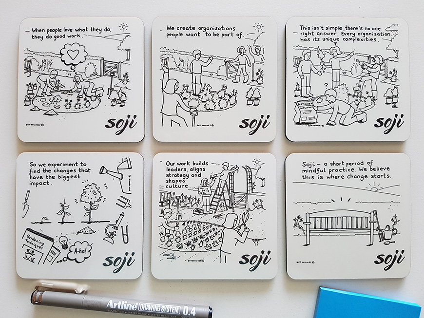
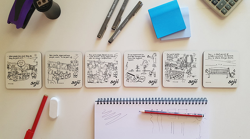
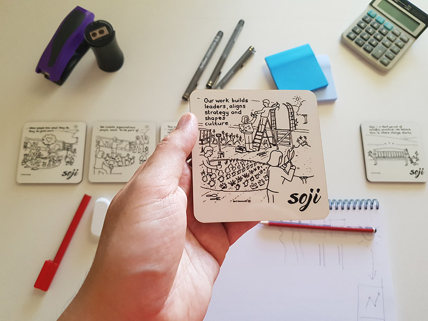
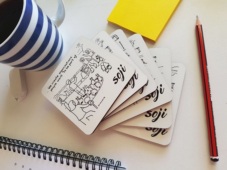
Discovery, curiosity, experimentation and storytelling are core to Soji Learning & Change – a nationwide consultancy based out of Adelaide that develops leaders, aligns strategy and shapes culture. So it was no surprise when they recently approached me with the brilliant idea of developing a set of coasters that tells a micro story as well as their approach to business. As the illustrator, my role was come up with a simple but rich metaphor that could bring the whole story to life as well as the individual sentence on each coaster. I centred my illustrations on people working to nurture and grow a beautiful garden.

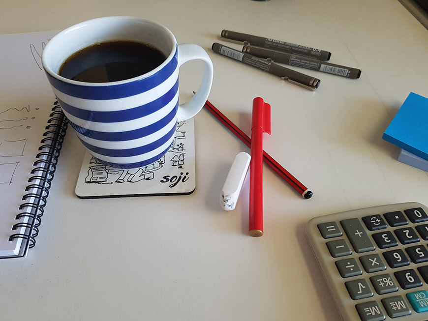
Other than a great spot to park your tea or coffee, the coasters will be used as client gifts and as an alternative to PowerPoint credentials in business development meetings to help spark dialogue and questioning. Imagine ditching the laptop or iPad and simply spreading six coasters on a table alongside the person you are meeting? For me that’s fresh, bold thinking and a great way to share a story and foster a meaningful conversation.
Coasters

Coasters

Coasters

Coasters

Illustrating a coffee table book for The Growth Project

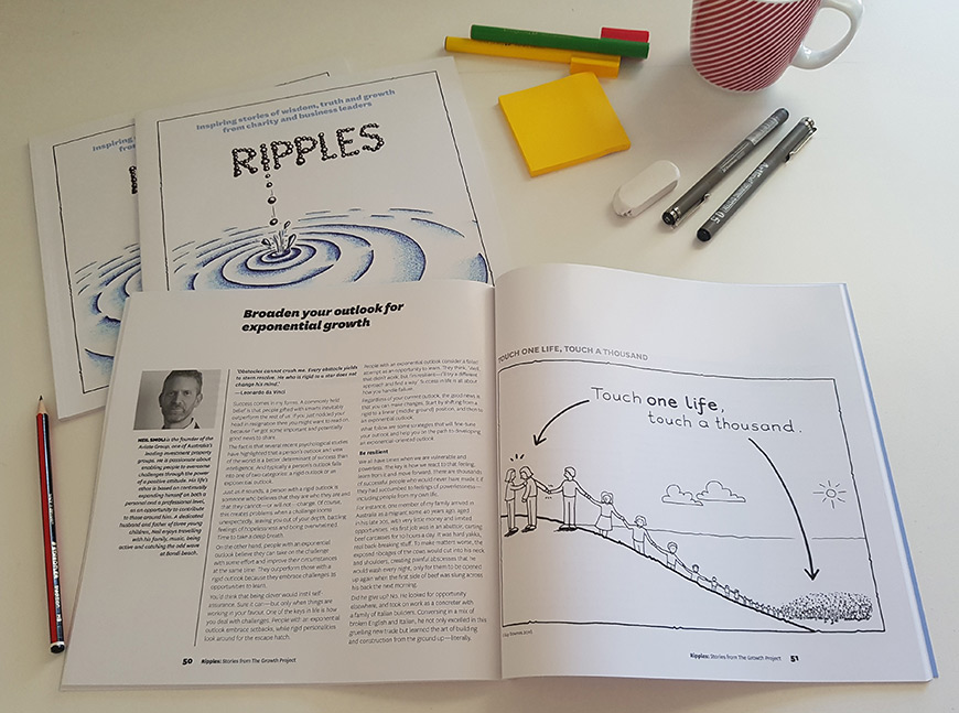
Ripples - book illustrated by Guy Downes
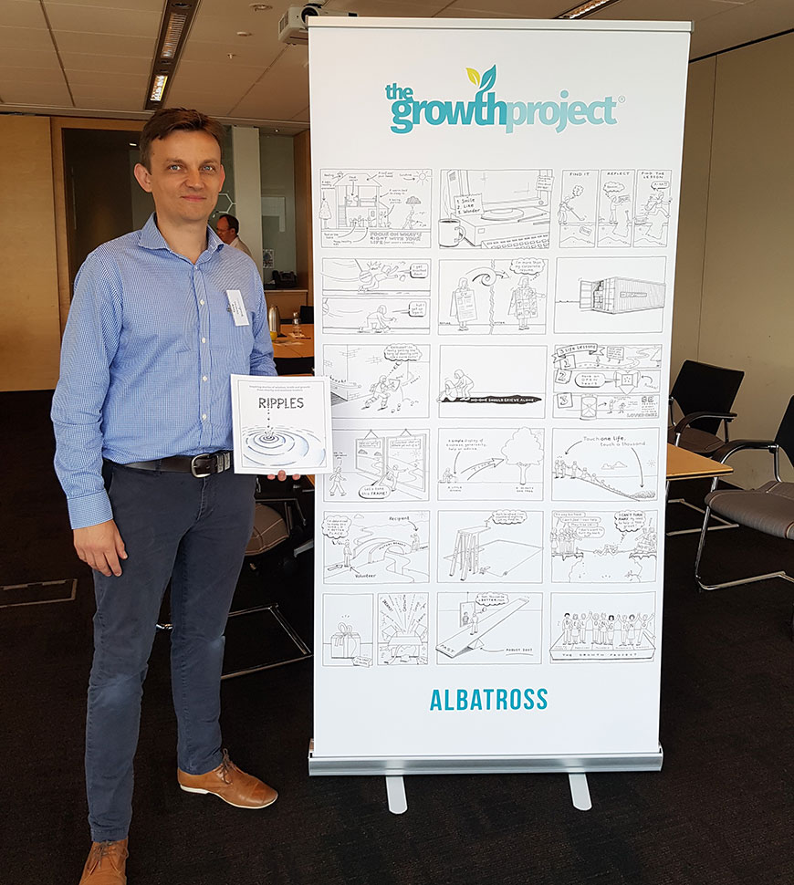
After 12 months of learning and growing as part of The Growth Project, the charity and business leaders involved in the program produced a collection of their thoughts, learnings and advice. These stories were pulled together to create an illustrated book called ‘Ripples’. As the book’s illustrator, my role was to bring to life a key message from each story with a simple B&W cartoon. As you can see, each illustration was given a full page, which really let each cartoon have a big impact. The first photo shows me at the book launch next to a banner with all the illustrations.

Filled with contributions from charities you might never have heard of and the business leaders who have travelled beside them in the journey, ‘Ripples’ shares great lessons and learnings that will inspire, move or spark you into action.

The Growth Project is a non-profit organisation that supports small, successful charities to maximise their impact on the world. You can see my previous work for The Growth Project here: http://www.guydownes.com/2015/10/helping-those-who-help-2/
Ripples - book illustrated by Guy Downes

AFR BOSS Roundtable: The secrets of innovation

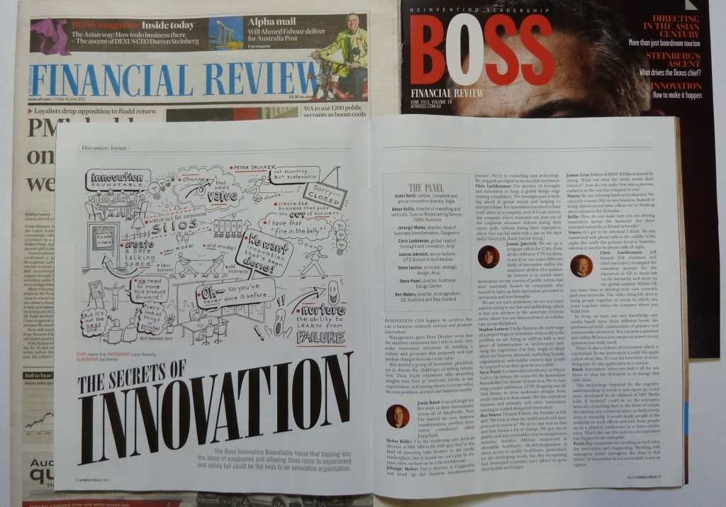
My illustration kicks off the AFR BOSS article

My illustration kicks off the AFR BOSS article

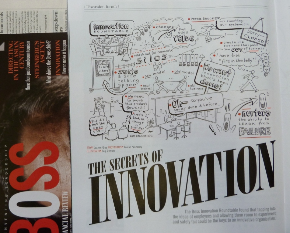
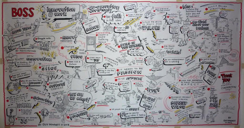
Today’s AFR BOSS features my graphic recording and follow-up illustration work from a recent fantastic roundtable discussion and subsequent article on “The Secrets of Innovation”. Speakers included thought leaders from ARUP, Jumptank, Aegis, SBS, Cap Gemini, UTS, Australian Design Centre and GE. My role included being the graphic recorder (or ‘visual note-taker’) on the day and you can see a photo of me within the article in action capturing the essence of the discussion in pictures on a large poster. I listened intently to the discussion and drew ‘live’ the big ideas, issues, opportunities and broad themes that were being covered in the discussion – the result being a 2.5m x 1m poster, which acts as a creative visual record and group memory tool to spark further thinking, ideas and conversation beyond the roundtable. I then worked with the editor of AFR BOSS, Joanne Gray, to distil the best points from my graphic recording poster into an illustration for inclusion in the article. The roundtable took place at the wonderful Object Gallery in Sydney.

AFR BOSS_illustration close up_Guy Downes

A close up of my illustration in AFR BOSS today

AFR BOSS panel_graphic recording poster_Guy Downes

My graphic recording poster (2.5m x 1m) capturing the essence of the discussion at the event.

AFR BOSS_detail_Guy Downes

The middle photo shows me graphic recording just to the side of the panel discussion

The Object Gallery_panel table and graphic recording poster

The venue beforehand with my graphic recording poster on the back wall

AFR BOSS Innovation Roundtable_web_Guy Downes

The AFR BOSS website with a small icon of my illustration to draw attention to the article

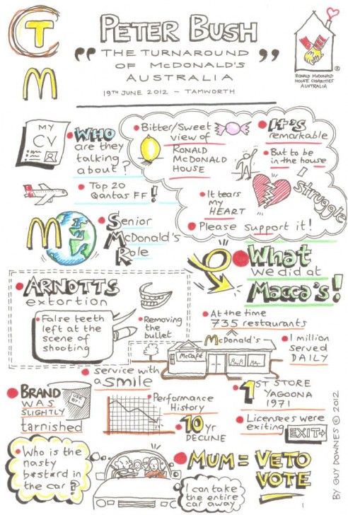
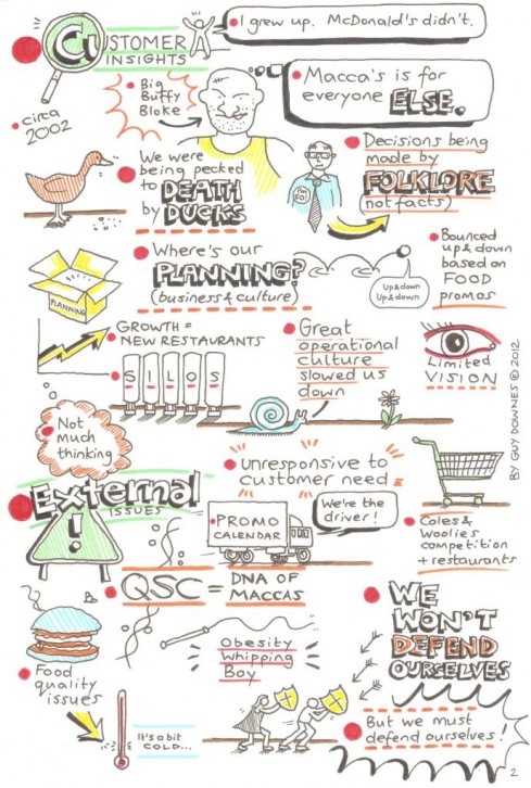
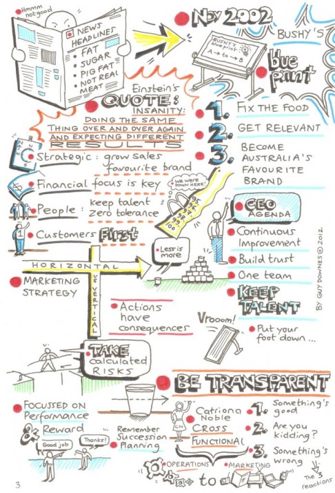
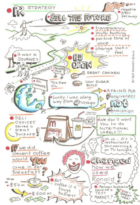
The turnaround of McDonald’s Australia: Peter Bush

Peter Bush: visual notes – page 1

These are my visual notes drawn during a presentation by Peter Bush, formerly CEO of McDonald’s Australia, at the Tamworth Business Chamber lunch in aid of Ronald McDonald House Charities. Peter’s presentation was riveting – full of business ideas, lessons learnt and top tips. Peter talked about his experience in turning around McDonald’s Australia and how he and his team helped propel McDonald’s Australia to be the best performing McDonald’s business globally for five consecutive years. The aim of my visual notes is to help remind me of some of the golden nuggets of advice Peter shared so that in 2 hours, 2 days, 2 months or 2 years time I can think back and remember the “essence” of what he said. Call it my own visual memory tool.

Peter Bush: visual notes – page 2

Peter Bush: visual notes – page 3

Peter Bush: visual notes – page 4

Peter Bush: visual notes – page 5

The Holy Trinity of public relations: illustrations

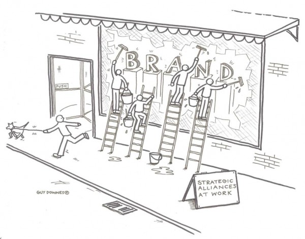
Illustraton: strategic alliances

I recently contributed two illustrations to Craig Pearce Strategic Communication’s latest white paper titled: The Holy Trinity of public relations: thought leadership, 3rd party credibiilty, strategic alliances.

Illustration: thought leadership

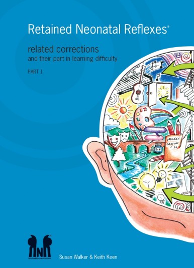
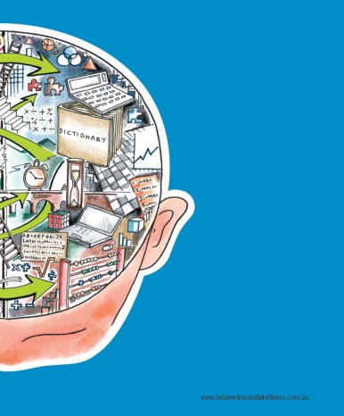
Left and right brain

Here are two of my illustrations of the left and right side of the brain that were featured on the front and back covers of a Retained Neonatal Reflexes (RNR) booklet by Susan Walker and Keith Keen. RNR is a revolutionary approach to treating children with learning difficulties and behavioural problems.

A double shot of ideas and insights

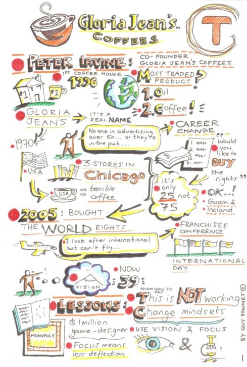
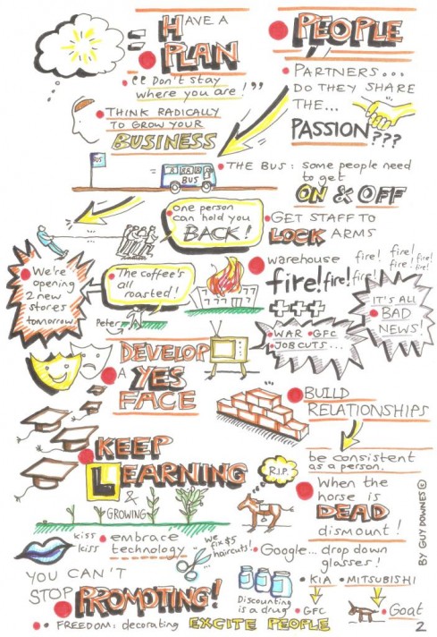
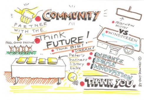
Visual notes #1: Peter Irvine

There’s nothing better than starting the day listening to an inspirational speaker. Today at Tamworth’s Chamber of Commerce business breakfast briefing Peter Irvine, the co-founder of Gloria Jean’s Coffee, provided a double shot of business ideas, energy, insights and advice. As with all good presenters, Peter captivated the audience with real-life stories and experiences. Truly a case of re-living his experiences, not re-telling them. Making a connection, not shovelling out content to the audience. Here are my rough visual notes drawn furiously while listening intently and trying to scoff down the great breakfast at the All Seasons hotel.

Visual notes #2: Peter Irvine

Visual notes #3: Peter Irvine

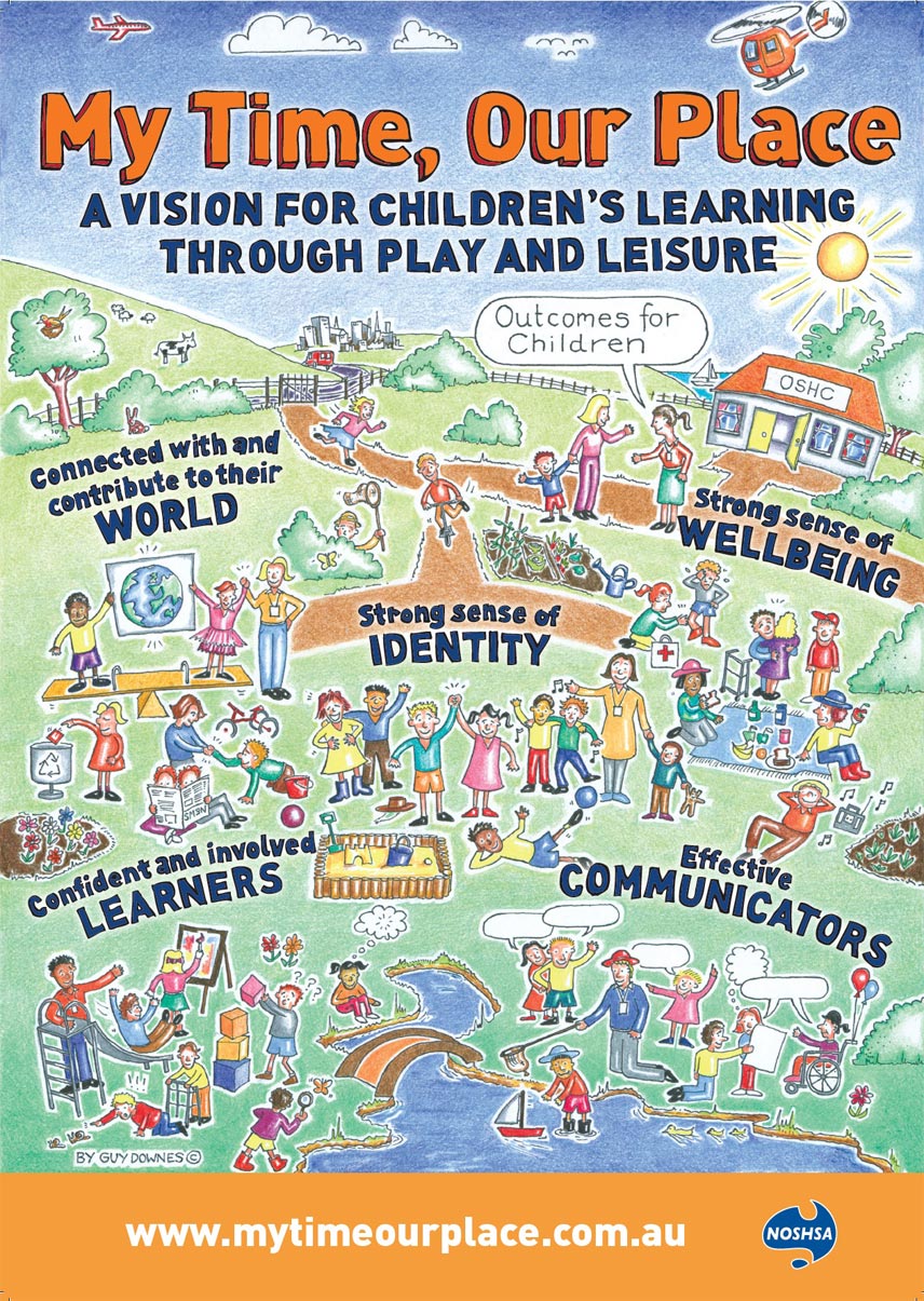
NOSHSA

“My Time, Our Place”

cs-nosha

Working closely with the team at Network of Community Activities, Guy created this bright, energetic and activity filled poster for the National Out of School Hours Services Association (NOSHSA). The My Time, Our Place – Framework for School Age Care in Australia will ensure that children in school age care will have opportunities to engage in leisure and play-based experiences which are responsive to the needs, interests, and choices of the children attending the service and contribute fully to their ongoing development.

Network of Community Activities is committed to helping promote quality community based services for school aged children, including children with disabilities.

Learning the Alphabet of the Human Heart

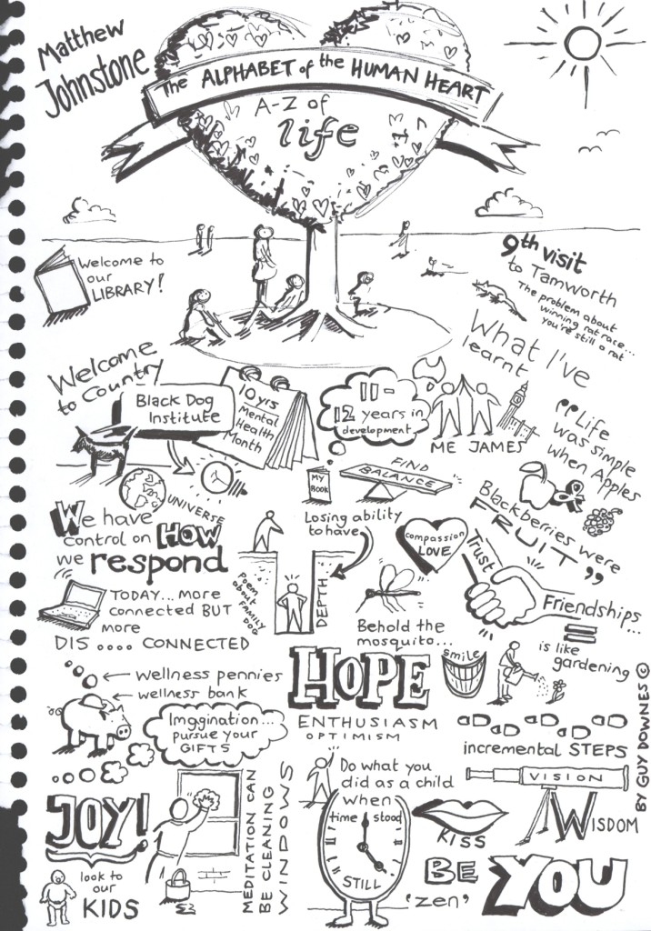
I’ve mentioned Matthew Johnstone before and it was great to have him back speaking at Tamworth City Library last week about his book: The Alphabet of the Human Heart. This page shows the visual notes I sketched while he was talking. You can tell when a speaker makes a connection with the audience – while talking, I looked around to see people (unaware to themselves) nodding, ‘hmmming’ in agreement or simply zoned in on what was being said. Matthew was definitely working his storytelling magic, helped by his pictures.
This book is beautifully illustrated by Matthew and was co-written with his long time friend, James Kerr. The book is described as: ‘A handbook for the happy, and a bible for the broken hearted, The Alphabet of the Human Heart is an enchanting and enriching journey through the upside and the downside of what it means to be human – our hopes and fears, our strengths and our weaknesses, our highs and our lows. It is an A to Zen of how we feel’.

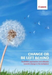
Cartoons for Canon ‘Change or be left behind’ research

Creativity

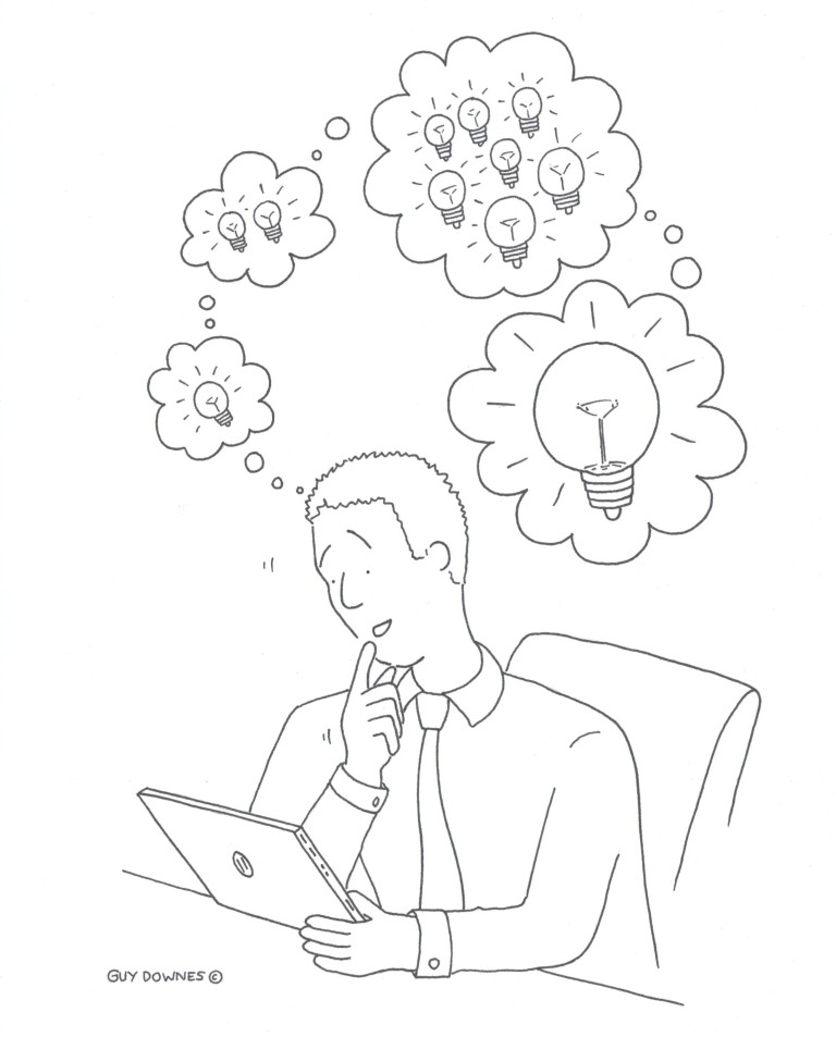
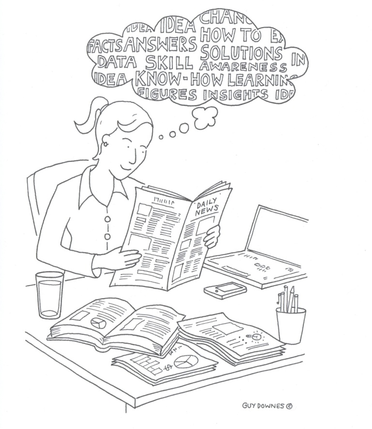
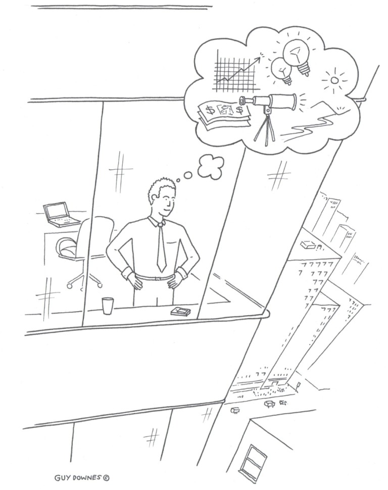
Canon Business Imaging Australia recently released a research report titled: ‘Change or be left behind’. According to Canon, ‘change is something that the majority of Australian businesses strive for yet find difficult to achieve’. The research examined Australian businesses’ approach and attitude towards change in the workplace. I contributed seven cartoons to the report which depicted light-hearted scenarios highlighting the qualities that were needed to help drive change (as identified in the research). If you’re interested in downloading the report and viewing all my cartoons, please visit: http://www.canon.com.au/Business/Change

Knowledge

Vision

Change or be left behind: the report front cover

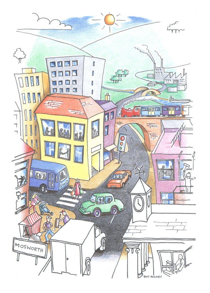
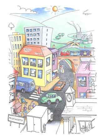
Welcome to Mosworth

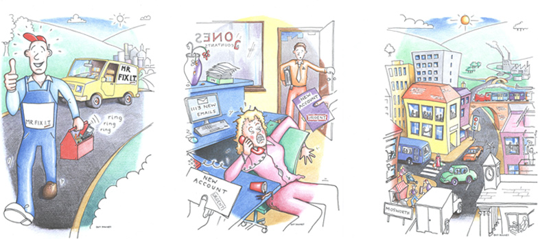
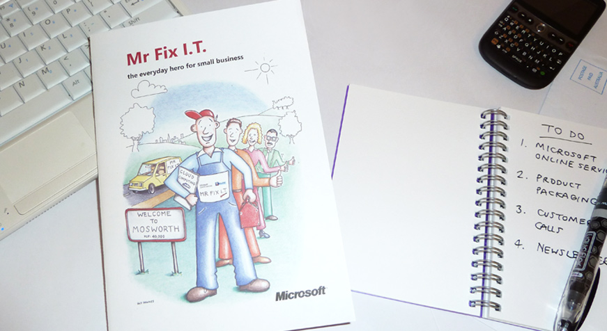
Welcome to Mosworth – this is one of my favourite illustrations that I created last year for a Microsoft Online Services booklet. The picture is full of colour, activity and things to look at.  The story booklet (called: “Mr Fix I.T. – the everyday hero for small business”) highlighted how computing can be simple for small to medium sized businesses with Microsoft Online Services. You can read the full case study here.

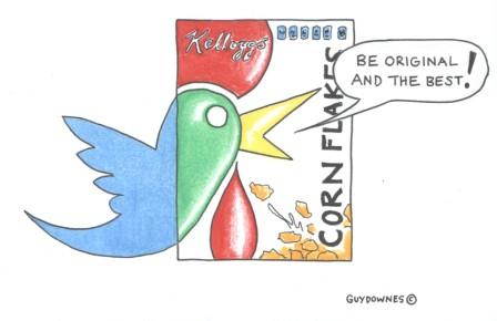
Kellogg turns to Twitter

As reported in mUmBRELLA, “Kellogg is looking for an agency to handle its public relations, and is using Twitter to aid its search in what the brand believes is the first time the medium has been used for this purpose”. A great idea that sparked my latest cartoon.

Cartooning for a global PR report

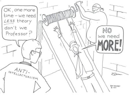
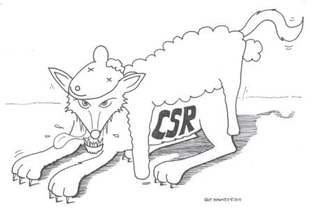
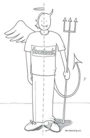
Back in March, I contributed three cartoons to a PR thought leadership report co-ordinated by Craig Pearce and titled: Public relations 2011: issues, insights and ideas. My cartoons supported three of the articles that discussed PR education, PR and CSR and Facebook/social media:

My cartoon for: PR education – getting the theory-practice balance right, by Professor Jim Macnamara, Professor of Public Communication at the University of Technology Sydney

My cartoon for: PR is second rate CSR, by Craig Pearce, an award winning strategic public relations professional (and noted PR blogger)

My cartoon for: Messiah or just socially inept, by Dwight Whitney, Founder, Trinity Communications

The report is a very good read for PR and communication professionals as it features articles by eleven industry leaders from all over the globe and is available free for email subscribers from Craig Pearce’s blog, Public relations and managing reputation. Content in the report will help enhance PR professionals’ practical ability and strategic knowledge, expand their knowledge of the discipline’s power and provide them with ideas and assertions. Thanks to Craig for getting me involved.

Drawing the steepest water slide at sea

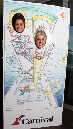
The water slide photo board at the media launch

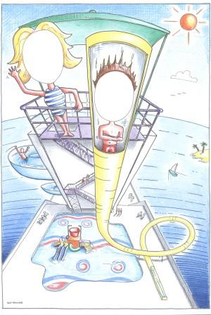
If you want to send your pulse racing, Carnival Cruise Lines has the answer: the steepest water slide at sea. Commissioned by Pulse Communications, I was asked to draw an artist impression of the slide for the recent media launch of Carnival Spirit, Carnival Cruise Lines’ first ship to be based outside the US. Carnival Spirit will be based in Sydney from October 2012 and she will be “Aussified” to create a new and unique cruise product. One of the biggest additions will be two new water firsts for the Australian market, a thrill slide and a splash park.

My job was to draw the slide and splashpark with spaces where people could pop their heads through for a quick photo opportunity during the media launch event at Luna Park. My final illustration was blown up in size and mounted for the event by Signwave.

My final illustration of the steepest water slide at sea

Case study: zooming in on creative ideas for Intel Asia Pacific

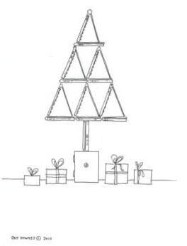
Developed ‘blue print’ illustrations to inspire an Intel Atom netbook photo shoot – final photos offered to consumer media in Asia Pacific during holiday season build-up

A final photo inspired by one of my concept illustrations

Issue:

  • The build up to the holiday season at the end of the year is an important sales period for consumer electronics (such as netbooks) across Asia Pacific. With the arrival of the iPad, the consumer hardware market had become even more competitive and ‘noisy’.

Insight:

  • The success of netbooks has been due to the fact they are small, light, portable, innovative and fun. Although the consumer hardware market had become more competitive, nothing has really changed with netbooks themselves, except from the fact that they have got better and better. So, in the run up to the holiday season, there was an opportunity to remind people why they fell in love with netbooks in the first place and shine the light back on their many benefits.

Challenge:

  • In order to showcase the breadth of choice available to netbook consumers during the Christmas/holiday season buying period, Intel set out to commission photography that would show the Atom netbook range in an innovative, creative and shopper-friendly way in time for consumer buying guides across the Asia Pacific region.  The final photos would also be used to pitch to consumer and technology publications.

My role:

  • Following a creative briefing session with Howorth, a business to business, consumer technology and enterprise technology public relations agency in Sydney, I was tasked with developing  a series of creative concepts that Intel could use across Asia Pacific as the foundation for their photo shoot and photography.
  • A key requirement in the creative process was to highlight the small form factors, breadth of range and innovative netbook designs made possible by the Intel Atom processor.

Idea:

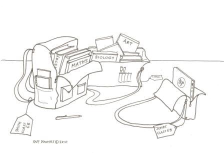
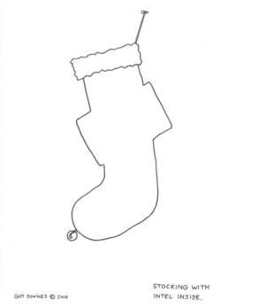
  • My creative idea was to use the netbook form factors e.g. its angles, shape (when open and shut) and its size, to replace, create or enhance items or situations that can be found or occur in the build up to the holiday season. In doing so, and using a simple illustration style, this would remind or introduce people to the great form factors netbooks have (e.g. small, breadth of range, flexibility, fun or simplicity etc)
  • The aim was that the final photos would mirror the simplicity and minimalism of the concept illustrations as well as build on them by placing them in aspirational and modern settings.

Original concept: open netbooks create a Christmas tree

Campaign results:

  • The photos were distributed to Intel’s PR agencies throughout the Asia Pacific region for use when liaising with consumer buying guides and relevant media publications.
  • Photos were made available to agencies in Australia, India, Indonesia, Korea, Malaysia, New Zealand, Pakistan, Philippines and Singapore.

Original concept: a thin netbook vs bags full of heavy school books

Final photo supplied to PR agencies across Asia Pacific

“Guy’s fresh thinking created some great ideas.  His illustrations formed the platform for some really innovative and consumer-friendly product photography that we used across the Asia Pacific region”.

Paul Thompson, Account Manager, Howorth

Original concept: profiling the small netbook form factor

Final photo: a small netbook fits neatly into a stocking

Media coverage example:

Photo appeared in The Sydney Morning Herald's online Digihub section

*Disclosure: I used to work at Howorth before launching my own visual communication practice.

Microsoft Australia

Mr Fix I.T. (the everyday hero for small business)

cs-microsoftcs-microsoft2

Guy illustrated a light hearted storybook about how SMBs could take advantage of Microsoft Online Services.

Set in the fictional town of Mosworth, the simple storybook recounted the story of Mr Fix I.T., the town’s friendly and in-demand computer expert, who helped a cross section of the town’s SMB owners with answers to their computing problems using Microsoft Online Services. Guy’s illustrations showed the characters ‘before’ (think: worried, stressed, overloaded) and ‘after’ (think: happy, productive, organised) Mr Fix I.T. had implemented Microsoft’s solution. Microsoft Australia printed over 3,000 colour copies of the A5 booklet, which were distributed to SMB customers and partners.

Case study: Mr Fix I.T. – the everyday hero for small business

Cartoon storybook highlights how computing can be simple for small to medium sized businesses with Microsoft Online Services

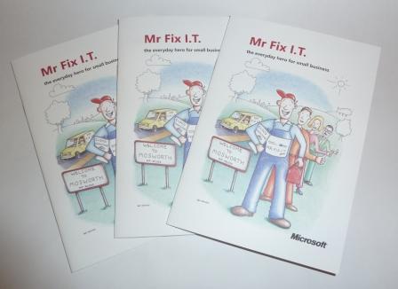
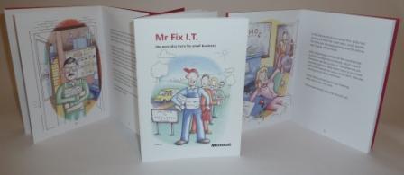
A collection of the printed cartoon storybooks

Issue:

  • Australia’s small to medium sized business (SMBs) owners are busy people. So, finding the time to understand, select and get the best from their computing technology can be difficult.  However, it’s their IT that can make one of the greatest positive impacts to their business.

Challenge:

  • The challenge lay in finding a quick, entertaining yet simple and educational way to shine the light on the benefits and advantages cloud computing (also known as Internet based computing or online services) can bring to SMBs.

Insight:

  • In today’s society, where people appear to be overloaded with information and seemingly with less time than ever before, storytelling with engaging imagery can be an important communication tool. 

Idea:

  • Working closely with Howorth, a business to business, consumer technology and enterprise technology public relations agency in Sydney, I recently helped illustrate a creative, fun and educational storybook that underscored how SMBs could take advantage of Microsoft Online Services (Howorth’s client).
  • Set in the fictional town of Mosworth, the simple-to-read illustrated storybook recounted the story of Mr Fix I.T., the town’s friendly and in-demand computer expert, who helped a cross section of the town’s SMB owners with simple, cost-effective and no-fuss answers to their computing problems using Microsoft Online Services.
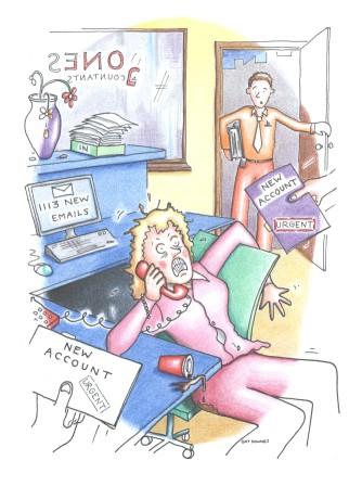
  • My illustrations showed the characters ‘before’ (think: worried, stressed, overloaded) and ‘after’ (think: happy, productive, organised) Mr Fix I.T. had implemented Microsoft Online Services for their businesses.
  • The booklet was balanced with the creative illustrated story as well as product information on the Microsoft Online Services suite, customer testimonials and a free 30 day opt-in trial for readers.

Campaign results:

  • Microsoft Australia printed over 3,000 colour copies of the A5 Mr Fix I.T. storybook, which were distributed to SMB customers, partners and media.

The booklet front cover illustration: Mr Fix I.T. with the story characters

Project responsibilities:

My role involved:

  • Working closely with the Howorth team to brainstorm and develop ideas that could be converted into a storybook highlighting the benefits of Microsoft Online Services;
  • Helping provide feedback and ideas on the storybook script developed by Howorth; and
  • Bringing-to-life the story and characters through hand-drawn illustrations using Black & White ink and traditional colour pencils.

The busy and in-demand Mr Fix I.T.

“Guy is a talented illustrator and he has really helped us bring to life the benefits Microsoft Online Services delivers to SMB customers. He has been great to work with, plus he really ‘gets’ complex technology and business issues and knows how to humanise them”.

Marie-Claire Suter, Senior Account Director, Howorth

The bustling town of Mosworth

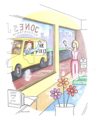
Kelly, the accountant, before discovering Microsoft Online Services

Cool, calm and collected: Kelly after finding Microsoft Online Services

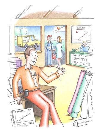
Steve, the textile manufacturer. A happy man thanks to Microsoft Online Services.

The booklets with a few open pages

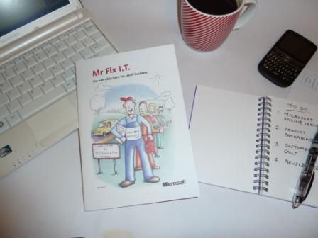
Netbook, smartphone, notepad, coffee and Mr Fix I.T.

*Disclosure: I used to work at Howorth before launching my own visual communication practice.

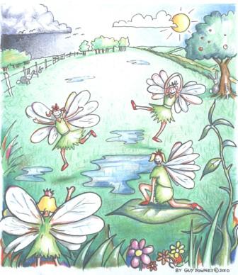
If you believe in fairies…

…you will no doubt know that fairies like to do a ‘dance’ when a thunderstorm has passed, the puddles dry up and the sunshine re-appears from behind the clouds.

The Fairy Dance

This is my latest illustration forLondon Mums magazine. It’s great to be given a kid’s story to illustrate and let the imagination open up. And here is my illustration in the next issue:

What type of digital media consumer are you?

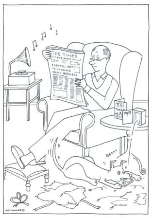
Working with the Edelman Technology PR team in London, I recently illustrated what the types of people using (and not using) digital media may look like. My three fictional cartoon characters accompanied a survey press release by HP PSG on digital media evolution and usage in the UK.

The HP survey revealed that while Brits ‘are not in the Dark Ages when it comes to the progression from physical to digital ownership of media, they’re far from being Space Age’. For example:

  • While 86% of the population access some form of digital media, 68% still prefer photographs to be physical rather than digital, 64% for music, 75% for films and a massive 95% for books.

My illustration brief was to ‘bring to life’ three possible digital media personalities based on generalised typologies:

  • A ‘Future Head’ (approximately 16-30 years old) who is the key embracer of change, always choosing digital over physical ownership. Basically, ‘gadget-mad’.

A Future Head: crazy about technology

  • A ‘Rolling Stone’ (roughly 30 to 50 years old) who rolls with the best of both worlds. They are technology literate but not obsessed and will adopt a technology only if they see a clear benefit (and usually after the ‘early adopters’).

A Rolling Stone: leading a busy life - no time to be too tech obsessed!

  • A  ‘Suspicious mind’ (probably 50 years old and over) who are the most resistant to technological change and still love, consume and own media in traditional formats.

A suspicious mind: nothing digital please!

It was a great project to illustrate and working across the time zones between Australia and the UK worked out really well – when the UK was sleeping, I was working on the brief.

Edelman is a big and trusted name in PR. They’re the world’s largest, independent PR company with over 3,200 people in 52 offices worldwide. In addition to being one of the leading PR firms, they are well known for sharing insights and reports, in particular The Edelman Trust Barometer. The Edelman Trust Barometer tracks trust in major institutions across Business, Government, Media and NGOs; in industry sectors; and the credibility of sources of information. The Edelman UK tech team also have a blog worth checking out if you’re interested in snacking on regular tech insights and opinions.

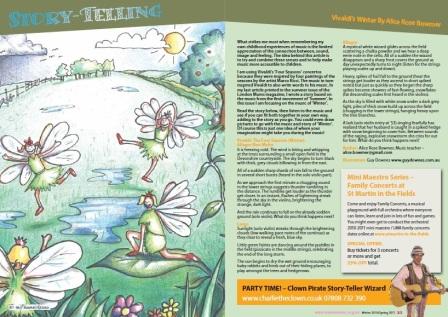
‘Story Time’: illustrations for London Mums magazine

Stories are an essential ingredient in children’s lives as they provide vital entertainment, learning skills and stimulation – plus they help them to understand the world around them.

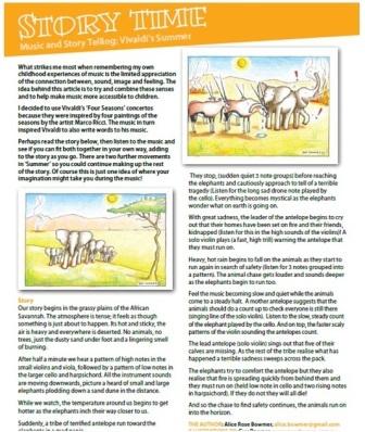
I recently illustrated a children’s story for the London Mums magazine ‘Story Time’ column. The aim of the story was to:

  • help strike a connection between words, sound, image and feeling and;
  • combine these senses and to help make music more accessible to children.

The writer invited children and their carers to read a story about a group of animals in the African savannah alongside a piece of selected classical music (Vivaldi’s Four Seasons).  They were invited to read the story first, then listen to the music and see if they could fit both together in their own way, adding to the story as they went based on what they were reading, the illustrations they were looking at and the music they could hear.

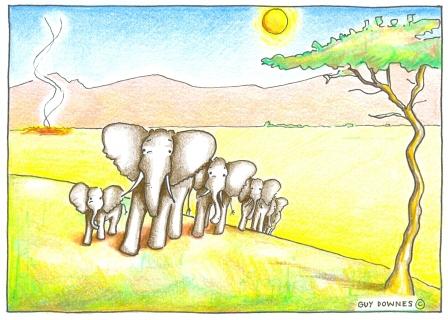
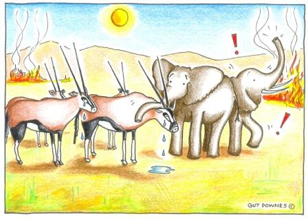
My role was to select two key moments and illustrate them to help bring the story to life and in doing so hopefully spark ideas and imagination as the child and carer were reading together. I illustrated these pictures using pencil, ink and colour.

London Mums magazine is the official publication of London Mums, the only free and independent peer support group for mums based in London (UK). The support group has over 10,000 full active members (as at May 2010) with members helping each other through the joys and challenges women face with raising their children. The magazine is complimented by its website: www.londonmums.org.uk

The magazine’s reach is large. 30,000 copies are delivered to antenatal / postnatal clinics and hospitals, local libraries, edutainment and leisure centres, nurseries and schools, family friendly shops and businesses across London.

The content is produced by London Mums Ltd and its editorial team focuses on topics and issues of interest to mums and mumpreneurs based in London. It features real mums’ testimonials, high profile family experts and celebrity mums.

Recent celebrities that have been interviewed for the publication include some high profile names, such as :

  • Amanda Hamilton, the UK’S most popular television “mum-presenter”, successful mumpreneur and writer,  best known for co-hosting BBC food and lifestyle programme “Something for the Weekend”
  • Jacquie Beltrao, Sky News presenter
  • Emma Forbes, former presenter of BBC children’s show ‘Live & Kicking’, broadcaster, a true London Mum and Mumpreneur
  • Some interviews are here.

Having lived in a big city with kids, I know that resources like London Mums are vital for Mums, parents, carers and children. It’s a good, relevant, interesting and colourful magazine – one that you can read at length over a coffee or dip into quickly at any time to get some top tips or useful ideas.

Sparkling Christmas Wishes – from Your Body Works!

Sparkling Christmas Wishes!

Sparkling Christmas Wishes!

Here’s the 2009 Christmas card I recently created and illustrated for Your Body Works – a successful and growing specialised Applied Kinesiology Chiropratic healthcare and Allied Health Clinic in Brisbane. 

This card has been sent to all their clients, suppliers and people who have had any type of interaction with the clinic over the past year — that’s quite a few people! My idea and purpose with this illustration was to add lots of slap-in-the-face bright colours to make it really memorable and fun to look at. Plus to include ‘Bod’, the clinic’s happy and flexible brand character, decorating the Christmas tree!

The final card...hot off the press & looking hot!

The final card...hot off the press & looking hot!

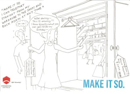
Engineers make it so!

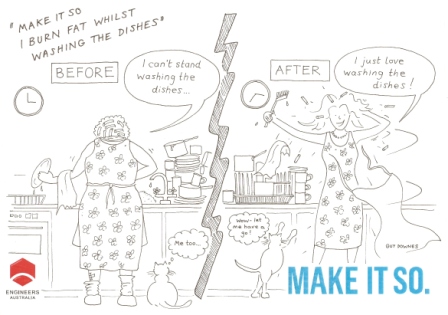
'Make it so I lose fat while washing the dishes'

'Make it so I lose fat while washing the dishes'

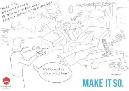
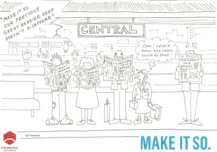
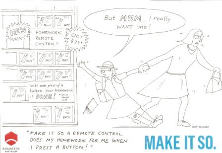
I recently completed a series of 11 original cartoons for the Engineers Australia ‘Make it so’ campaign. My illustrations were based on the notion that engineers and engineering teams ‘make it so’ by listening to what people want and communities need and turn these wishes into reality.

The cartoons supported a media relations outreach campaign to consumer journalists who were asked to dream up what they would like to be ‘made so’.

I brought each journalist’s idea to life in a cartoon which was then sent to them as a follow up after their interviews by the agency running the campaign, Pulse Communications. Media involved ranged from magazines such as Madison, Better Homes & Gardens, K-Zone  to Girlfriend.

'Make it so my lazy kids are flipped out of bed when I press a button'

'Make it so my lazy kids are flipped out of bed when I press a button'

From late February 2010, in a world first competition, Australians will be called upon to visit a dedicated website www.makeitso.org.au to share their dream, wish or idea and one lucky person will have it ‘made so’.

The unique competition is a part of a new public awareness campaign by Engineers Australia’s that aims to lift the curtain on what engineers actually do, by involving everyday Australians in the world of engineering in a fun and entertaining way.

'Make it so our precious Great Barrier Reef doesn't disappear'

'Make it so our precious Great Barrier Reef doesn't disappear'

From bridges to Blackberrys, drinking water to the Water Cube and plastic knees to petrol-free cars – engineers ‘make it so.’

'Make it so a remote control does my homework for me when I press a button'

'Make it so a remote control does my homework for me when I press a button'

'Make it so I can teleport from my wardrobe to the shops and back again at any time'

'Make it so I can teleport from my wardrobe to the shops and back again at any time'

Cartoons instead of words: Lion Nathan internal presentation

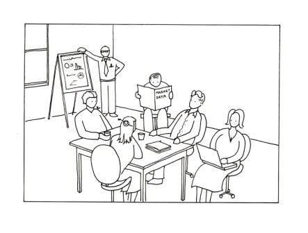
Marketeers in a meeting

Marketeers in a meeting

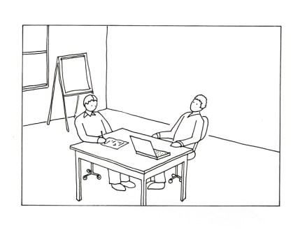
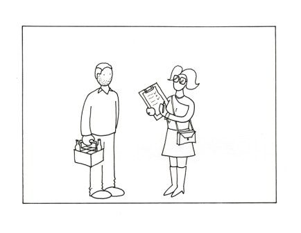
Working with Impact Employee Communications earlier this year, I was commissioned to help turn the content of a ‘word-heavy’ powerpoint presentation (that a Lion Nathan senior executive was giving to a large internal audience) into cartoon strip-style illustrations. The objective was to help the senior executive present the data as a story in a compelling yet clean and simple way – allowing them to move away from powerpoints slides overloaded with data and information. You can see the illustration style I used reflects this brief –  it’s very minimalist using clean black and white line drawings. Here are a few more illustration frames to give you a sense of what I did:

Brainstorm in session

Brainstorm in session

Market research

Market research

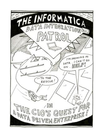
Informatica D.I. Patrol: saving CIOs drowning in data!

In search of the data driven enterprise

In search of the data driven enterprise

About six months ago while at Howorth (an Ogilvy PR company), I was thrown a dream and ‘carte blanche’ illustration brief by Luca Penati and his Ogilvy PR Tech Practice team in San Francisco. I was given the opportunity to humanise and ‘bring to life’ the business benefits of Informatica’s data integration software and approach in a cartoon strip. The cartoon strip was used in the new business meeting and Ogilvy PR were successful in winning the Informatica PR business. I’d like to think my cartoon strip was one ingredient in delivering a fresh approach to telling an important technology and business story.

My idea was to illustrate the key issues around data integration – by illustrating a CIO working late at night on an impossible deadline and drowning in data. Enter stage left: The Informatica D.I. (data integration) Patrol! A highly skilled, high impact unit that swoop in to help any CIO that they pick up on their ‘D.I. disaster’ radar who is drowning in data. By swooping in to help the CIO deploy Informatica’s platform and solutions the Patrol blast away the data integration disaster and transform the business into a data-driven enterprise!

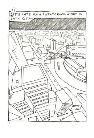
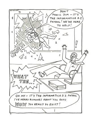
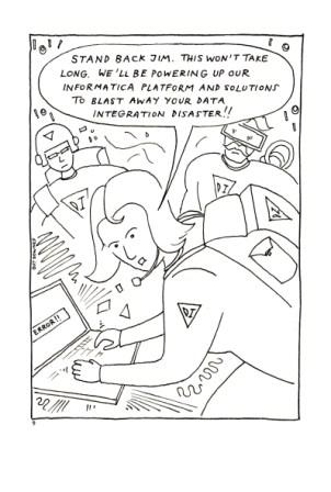
It was a lot of fun (thank you Luca and team) and I really enjoy this type of brief : translating a complex and important business technology issue into a fun, light-hearted and easy-to-read cartoon. Here are some frames to give you a flavour:

It's late on a sweltering night in Data City...

It's late on a sweltering night in Data City...

Don't panic Jim!

Don't panic Jim!

Stand back Jim - this won't take long!

Stand back Jim - this won't take long!

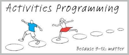
Logo design for 9-12s Kids Activities Programming

9-12s activities do matter

9-12s activities do matter

Activities for kids really do matter and can make such a positive impact. Kids benefit on so many levels such as: exercise, friendships, new skills, building self-esteem and confidence and having fun – the list goes on.

I recently created this logo design for ‘The 9 – 12’s Project’ – an initiative to enhance activities programming for 9 – 12’s in the Metro South West Sydney Region. This area encompasses the Local Government Areas of Bankstown, Fairfield, Liverpool, Campbelltown, Camden, Wollondilly and Wingecarribee. A key goal is to improve access to activities that promote positive development for children aged 9 – 12.

I gave some deep thought to the design and content of my illustrations which I used to convert into the final logo.

The seven stepping stones represent the seven local government areas mentioned above that will act as the foundation for this initiative. The two kids are stepping on the stones as they make their way from the start to their destination and each stride stretches them to make new progress – similar to the effect that the activities programme will have on participating kids. I tried to add movement and momentum in the illustration as the kids jumped from stone to stone.

If my illustration and short overview has peaked your interest, for more information, please go to: http://www.cnet.ngo.net.au/content/view/45489/

Premiere Global Services: cartoons for APAC fax campaign

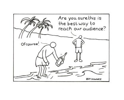
PGS fax campaign: message in a bottle

PGS fax campaign: message in a bottle

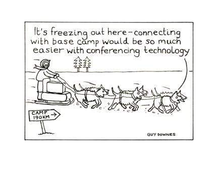
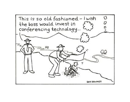
Working with the Premiere Global Services marketing team based out of Singapore, I was commissioned to illustrate a series of cartoons to demonstrate to marketeers in Singapore and Malaysia that email marketing and conferencing are one of the most cost effective mediums available in a downturn.

My aim for each illustration was to take at light-hearted and fun look at situations where people were using outdated methods to reach key audiences – the ‘message in a bottle’ is particular personal favourite. My cartoons were used in a fax campaign to key marketing targets across Singapore and Malaysia.

PGS web conferencing: it's so much easier...

PGS web conferencing: it's so much easier...

PGS conferencing: invest in new technology...

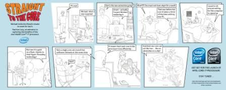
‘Straight to the core’: Intel processor launch cartoons

Intel comic strip #1

Intel comic strip #1

To see my full size cartoons on the Intel website, click here.

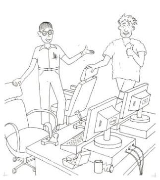
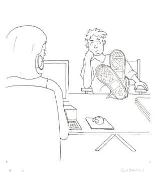
Last year, I illustrated three cartoon strips for the launch of Intel’s Core i7 Processor – a mighty fast processor that delivered an incredible breakthrough in PC performance. Working with the team at Howorth, I illustrated the light-hearted scripts showing two mates, Ken and Michael, in real-life scenarios which demonstrated the benefits of the technology. Click on the link provided at the top to take a look at the illustrations and story lines in detail.

Intel cartoon strip #2

Intel comic strip #2

In terms of ROI, my cartoons provided a fun way to inform and educate media and consumers of the end-user benefits. The cartoons were used in three markets (EMEA, APAC and US) during the launch.

In detail: frame #1 from comic strip #1

In detail: frame #1 from comic strip #1

Intel comic strip #3

Intel comic strip #3

In detail: frame #7 in comic strip #2

In detail: frame #7 in comic strip #2

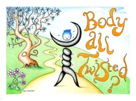
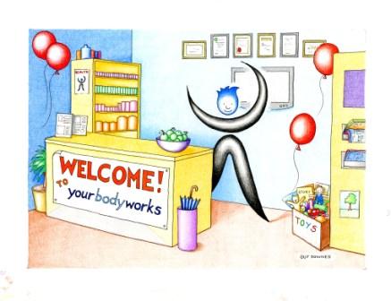
Your Body Works: bringing the brand logo to life

Your Body Works: body all twisted?

Your Body Works: body all twisted?

Your Body Works is a specialised Applied Kinesiology Chiropractic and Allied Health Clinic in Brisbane. Their highly personalised and patient-centric approach means that a person’s healthcare is tailored to the individual requirements of their body.

I was commissioned by Susan Walker, the founder of the business and a highly skilled AK practitioner, to help personalise their logo and bring it to life as a ‘brand character’ in illustrated scenarios, that could double up as marketing collateral and also be used in correspondence with patients. My illustrations have been used for direct marketing, patient reminders as well as welcome letters when people first the clinic.

Susan has further exciting plans for the Your Body Works character I created (affectionately known as  ‘Bod’) and I recently completed a Christmas card illustration for her clinic. Susan has also used the character outdoors on the outside of her building – exciting stuff.

Welcome to Your Body Works: post card

Welcome to Your Body Works: post card

Children’s book illustration: The Secret Garden

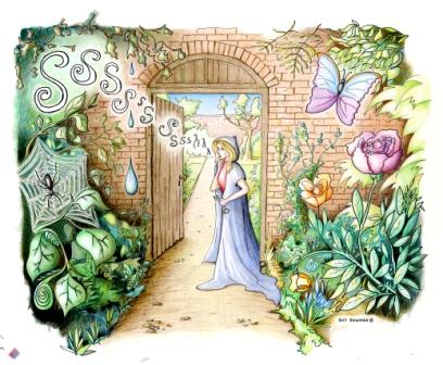
Ssssh...the secret garden

Ssssh...the secret garden

For decades now, I have been interested in the concept of a ‘secret garden’. I think it stems from growing up as a kid in the country and exploring the surrounding gardens, fields and countryside. This illustration depicts a hidden secret garden that you (the viewer) is being ushered into quietly by a mysterious caped lady. I pitched the style of this illustration for a children’s story book and included the detail that kids love: darkness, an evil spider and shadowy undergrowth on the left transitioning into warm, beautiful flowerbeds full with a friendly, fluttering butterfly on the right.

Ogilvy PR office move: ‘Welcome Guide’

Ogilvy is heading north

Ogilvy is heading north

The Ogilvy PR family of specialist communication businesses moved ‘north’ with the majority of other Ogilvy and STW companies in July 2008. My illustrations played an important role in one key element of this move for Ogilvy PR – the internal communications. It was very important to make the move from Sussex Street in the hustle and bustle of the Sydney CBD to St Leonards as seamless as possible. Ogilvy PR put a lot of time, thought and man hours into getting this right. One ingredient was ‘Welcome Guide’  that every employee received on their first day in the new building. The guide, filled with my illustrations and characters in each section, included a range of useful information to make the transition smoother.
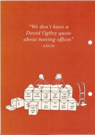
Welcome!

Welcome!

Shifting boxes

Shifting boxes

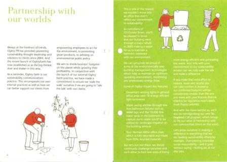
Partnerships with our worlds

Partnerships with our worlds

BMC Software: APAC illustrated eDM campaign

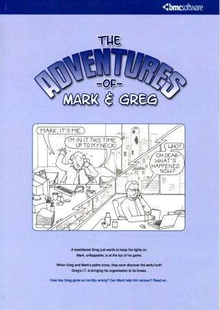
The Adventures of Mark & Greg: Australian eDM

The Adventures of Mark & Greg: Australian eDM

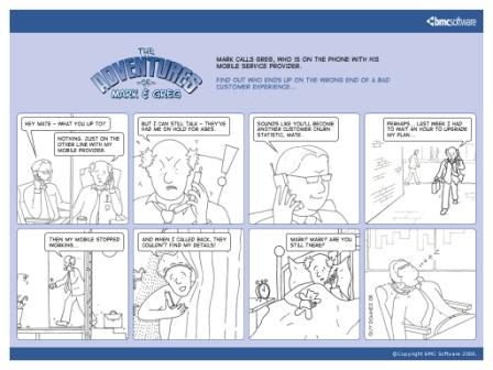
Following on from the success of ‘The Adventures of Mark & Greg’ technology leadership book, BMC Software decided to use the characters for an email direct marketing (eDM) campaign across the Asia Pacific region. Using a tightly worded script, I created eight illustrations to match the copy and worked closely with BMC and the design team to bring these illustrations to life in digital format for email distribution. The eDMs were sent out in Australian, Chinese Korean and Japanese versions.

Chinese eDM version

Chinese eDM version

Ogilvy PR APAC regional conference: presentation illustrations

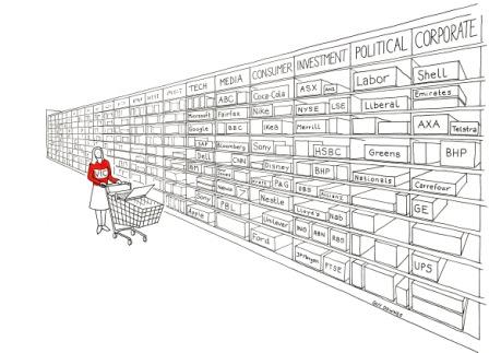
Very Important Consumer: choice overload

Very Important Consumer: choice overload

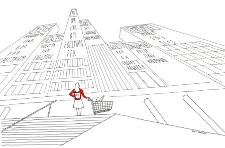
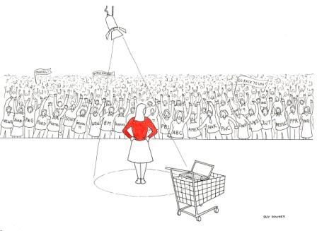
I was commissioned by John Studdert, managing director, Ogilvy PR Worldwide Australia to create three illustrations to accompany his key note presentation at a 2008 Ogilvy PR regional conference. The objective was to depict three scenarios where a consumer is faced with a flood of information and choices, whether that be which products and services to choose, which supplier to select and how employees have a wealth of options when choosing their career path. The illustrations I created were crisp, clean B&W ink line drawings showing a main character (wearing an eye-catching red jersey) faced with an ocean of choices.

Very Important Client: choosing a supplier

Very Important Client: choosing a supplier

Very Important Consultant: choosing the right career

Very Important Consultant: choosing the right career

BMC Software: ‘The Adventures of Mark & Greg’ book

The Adventures of Mark & Greg

The Adventures of Mark & Greg

Technology jargon regularly helps people fall asleep. BMC Software recognised that IT language can sometimes have the opposite desired effect when describing campaigns, products or services.

So, to remedy this BMC Software crafted two central characters with everyday problems to spearhead a campaign on ‘business service management’. A storybook called ‘The Adventures of Mark & Greg’ was born (the idea of which was created and nurtured by Pip Livingstone and her team from BMC and written brilliantly by Richard Carter from Talkies in NZ). My job (a dream job) was to illustrate it — letting illustrations accompany the copy and helping readers visualise complex concepts in everyday scenarios.

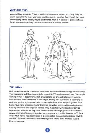
The book is based on the lives of two fictitious CIOs: Greg, who runs the IT in an error-prone technology organisation; and Mark, who runs a slick technology operation and tries to help Greg by sharing advice. The book underscored the very problems faced by CIOs every day and painted a vivid and real picture of BSM’s value.

In terms of ROI, the book was welcomed by technology media and the campaign has been promoted internally at BMC as a best practice case study. In addition, the book was adopted in BMC’s global new-hire programme. Every new BMC employee is given their own copy. BMC also created a ‘Mark and Greg’ video based on the book, used to support marketing activities.

In terms of industry recognition, the wider campaign picked up three awards at the PR Week Asia 2007 awards:

  • Best Technology PR Campaign of the Year
  • Best Regional (Asia Pacific) Campaign of the Year
  • Best Business to Business Campaign of the Year
Meet our CIOs: Mark and Greg

Meet our CIOs: Mark and Greg

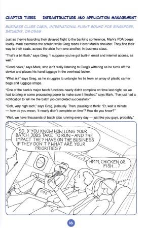
Business class cabin to Singapore

Business class cabin to Singapore

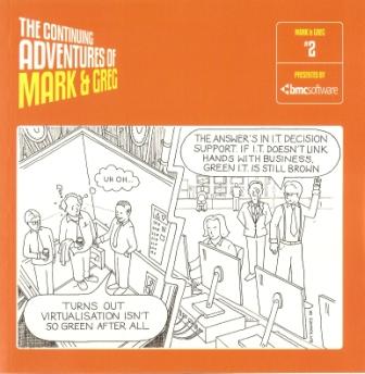
BMC Software: ‘The Continuing Adventures of Mark & Greg’ book

Cool Mark vs hapless Greg: second book front cover

Our CIO friends, Mark & Greg: second book front cover

Thanks to the massive success of the first BMC Software ‘The Adventures of Mark and Greg’, the BMC Software marketing team decided to do it all again. It was great to bring my characters back to life in a new story. Here’s the front cover illustration – this time the book was slightly smaller and designed to have a much slicker ‘look and feel’. I have also included a couple of chapter illustrations to show some of the visual detail I created in the story.

In short, this book carries on the story of two imaginary CIOs, the successful and organised Mark and the hapless and bumbling Greg. Both run the IT Department for competing banks but socially are good friends. In the latest book, Mark and Greg are recruited to help readers translate highly abstract ideas about IT management and Business Service Management. BMC Software used the book across multiple markets to educate and inform customers, partners, prospects, staff and media.
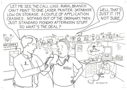
So what's the deal?

So what's the deal?

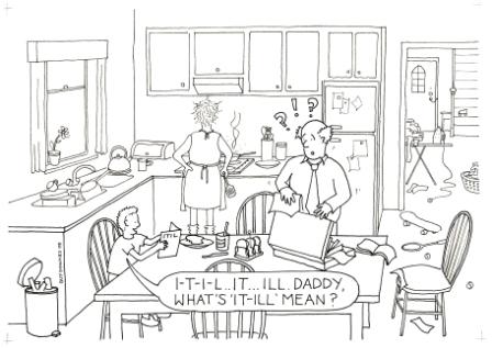
What's I-T-I-L mean Daddy?

What's I-T-I-L mean Daddy?

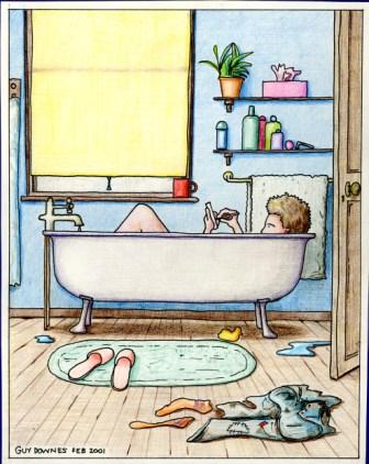
Shampoo, towel, talc, slippers, smartphone…

Get connected. Anywhere.

Get connected. Anywhere.

When Smartphones first came out (they were known as PDAs or Pocket PCs back then — I am showing my age…) I was really taken by the concept of being able to access information and stay connected to people no matter where you were. In 2001, I created a doodle which came to life as this illustration showing a person in the bath using their Smartphone. It’s probably not the best place to use an electronic device but I like the illustration all the same as it positions two objects in a location where they would never have existed if it wasn’t for the advance of technology. Checking email in the bath? Who would have ever thought.

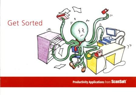
Scansoft: Get Sorted brochure

Drowning in data and paper? Scansoft can help

Drowning in data and paper? Scansoft can help

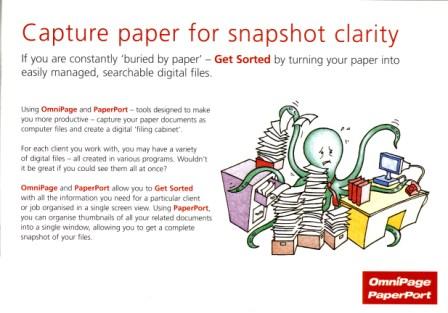
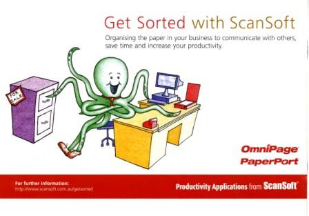
Whilst working at Howorth, Australia’s #1 technology and business communications specialist, I got the great opportunity to pitch some illustration ideas for a Scansoft point-of-sale brochure. It’s aim was to help small business owners understand how productivity applications can streamline operations. As SMB owners are juggling about eight things at once, I developed the concept of an Octopus trying (unsuccessfully) to multi-task. Through-out the brochure the Octopus is struggling with situations where Scansoft’s applications can help. The end illustration: Octopus is using Scansoft and he had ‘got sorted’. The brochure was used in leading electronic retail outlets. My illustrations were also used in an advertising campaign.

Buried by paper? Don't be.

Buried by paper? Don't be.

Got Sorted!

Got Sorted!

Microsoft at GSM World Congress: media invite cartoon

Communication: any time, any place, any device

Communication: any time, any place, any device

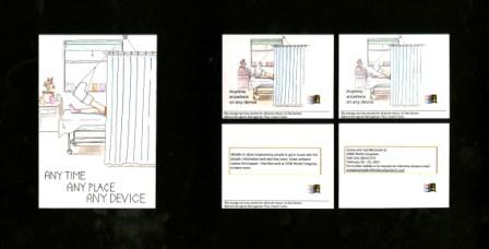
Getting cut-through with in-demand technology media in the UK can be a (very) hard slog. To help the Microsoft Windows Mobile PR team at Miller/Shandwick Technology (now Weber Shandwick) capture the attention of media they were targetting for GSM World Congress 2001, I created this illustration invite, which formed the basis of an email invite. My unique illustration was animated digitally to catch the journalist’s eye (the image above shows the still frames of the 10-15 second email).  The accompanying copy provided information on Microsoft at the event and how media could secure their spot.

Broken leg? Pocket PC? No worries then.

Broken leg? No worries with a Pocket PC

Parker & Partners: election tarrot card invite

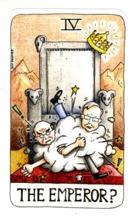
Rudd vs Howard: the tussle to be 'Emperor'

Rudd vs Howard: the tussle to be 'Emperor'

Parker & Partners (an Ogilvy PR Worldwide company) is one of Australia’s leading bi-partisan public affairs specialist. In 2007 I created this election tarrot card illustration, which doubled as the back of P&P’s invite to politicans, media and advisers for P&P’s annual Canberra Christmas Dinner. The event was held a little early, ie September, to beat the poll. The theme of my invite and the event was fortelling the future. Fortune tellers and tarrot card readers were also on hand at the event to let MPs know if they are to win or lose in November and my illustration was also enlarged and projected on the venue walls.

P&P Christmas Dinner: a night of predictions

P&P Christmas Dinner: a night of predictions

Parker & Partners: invite follow up

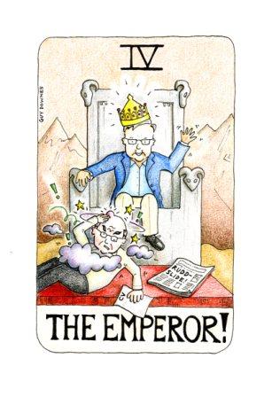
The Emperor: Howard gets hit by the Rudd-slide

The Emperor: Howard gets hit by the Rudd-slide

After the 2007 election when Labor had secured victory, I followed up my initial Parker & Partner Christmas invite illustration with the actual outcome  of the tussle to be ‘The Emperor’. ‘Kevin 07’ had become a reality. This cartoon illustration was posted on the P&P blog accompanying news of the election results.

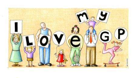
Your Health newsletter: I love my GP

Your Health: I love my GP

Your Health: I love my GP

I was invited to pitch some illustration ideas to Your Health newsletter thanks to the (inspirational) Richard Sauerman http://wakeuptiger.blogspot.com/ This is my illustration that made the cut for the newsletter’s direct marketing campaign to GP’s across Australia. It’s one I really like as the illustration is simple, eye-catching with a strong message. I got repeat business on the back of this effort, which was great. You may have heard about Your Health: it’s a neat, interesting health newsletter that you’ll most likely spot at your local GP in the waiting room. For more info: http://www.yourhealth.net.au/

Your Health

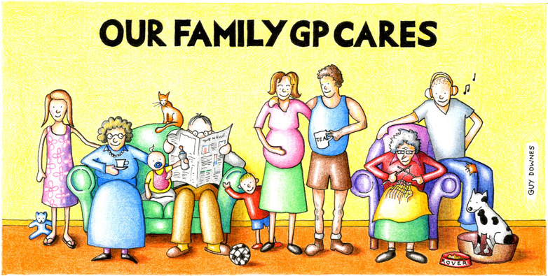
“Our Family GP Cares”

cs-yourhealth

Working for Your Health newsletter, my illustration featured on a direct marketing postcard mailed out to GPs. The aim was to create an eye-catching illustration that stood out when it landed on the GP’s desk.